


2 Minutes of Your Time
Key Takeaways
- The best utility websites prioritize self-service functionality, including bill pay, outage reporting, account management, and real-time alerts, so customers can quickly complete essential tasks without needing support.
- Standout utility site designs include California Water Service, PA Power Switch, Altogether, DTE Energy, California Public Utility Commission, Nova Scotia Power, ComEd, and more.
- Leading utility websites emphasize clarity, accessibility, and mobile responsiveness, ensuring all users, including those with disabilities or urgent needs, can easily access critical information on any device.
- Features like outage maps, bill forecasting tools, and rate comparison tools build trust and reduce support volume by giving customers transparency into services and costs.
- Modern utility sites stand out by combining strong UX design with branding and communication, using clean layouts, bold visuals, and educational content to improve engagement while reinforcing reliability and customer trust.
Utility companies provide a vital service to customers throughout the United States and the world. As if it weren’t complicated enough to ensure everyone has access to clean, safe water, gas, and electricity, utility companies also have to provide high-quality customer service. A well-designed website can help make this goal a reality.
Utility company websites should provide basic information to customers, but should also allow them to access their accounts, report outages, and get alerts for bills and emergencies. As utility companies offer a public service, these websites should be easy to navigate and accessible so all customers can utilize them.
Inclind’s award-winning website design and development team has significant experience helping utility companies build smart, responsive websites. We understand the specific needs of utility companies, including the need to have custom features like outage maps. Reach out today to learn more about our website design, development, and support and maintenance services.
What Is a Utility Website?
A utility website is a digital platform used by companies that provide essential services, such as electricity, water, gas, and energy, to allow customers to manage accounts, report outages, access billing information, and receive real-time service updates.
Power Up Your Digital Experience
Is your utility website addressing the changing needs of customers?
From service alerts and outage updates to secure account access and mobile-friendly tools, we design utility websites that deliver reliability and ease for users and internal teams. Ready to modernize your utility’s digital presence?
17 Great Utility Website Examples
If you’re looking to design - or redesign - a website for your utility company, having examples can help you figure out what you want (and don’t want). Below, we have collected some of the best utility website examples to help you get started.
To create this list, we analyzed over 200 utility websites. We judged sites based on a list of extensive criteria, including ease of navigation, accessibility, mobile responsiveness, design clarity, visual appeal, CTA quality, and web tools. We then narrowed down our list to the best 17 sites based on our criteria.
| Organization | Key UX Features | Standout Design Elements |
| California Water Service | Mega menu, persistent shortcuts, alerts | District-based personalization, clean flat UI |
| PA Power Switch | ZIP code lookup, simple nav | Government trust signals, social proof |
| Altogether | Account connection widget, quick-action tabs | Bold colors, editorial-style layout |
| DTE Energy | Audience toggle, quick links | Collapsing nav, rotating hero |
| California Public Utility Commission | Accessibility controls, structured content | High contrast, info-dense layout |
| Nova Scotia Power | Quick links, slide-out login | Sustainability storytelling |
| ComEd | Hero shortcuts, live chat | Bold color identity, block layout |
| Dominion Energy | Location selector, intent-based nav | Clean hierarchy, storm prep content |
| Southern California Edison | Persistent action icons, language support | Dark mode, wildfire-focused content |
| Southern Company Gas | Editorial navigation, safety CTA | Story-driven layout |
| FirstEnergy | Repeated CTAs, multi-channel outage reporting | Icon consistency, simple layout |
| Delaware Electric Co-Op | Persistent CTAs, tabbed routing | “Beat the Peak” feature, strong branding |
| Aquarion Water Company | Sticky shortcuts, live chat | Educational content, virtual tours |
| Florida Power & Light | Region selector, quick links | Outage tools, product promos |
| Orange & Rockland | Dual-hero layout, audience segmentation | Clean energy focus, color usage |
| Liberty Utilities | Location selector, simplified routing | Emotional messaging, clean visuals |
| Eagle River Water & Sanitation District | Quick links, “I want to” nav | Water risk gauge, bill forecaster |

California Water Service
The California Water Service website is not only a great-looking site, but it's also one that we've worked on extensively. The previous design suffered from an outdated navigation system that left users struggling to find the information they needed. Inclind redesigned the site and overhauled the navigation. We developed a mega menu and re-categorized menu items. We also changed out the quick links under the hero to better prioritize popular pages and implemented a sophisticated alert system to display alerts like the one you see in the screenshot above. The simple, flat design and large CTA buttons help to declutter the user experience and guide users towards the next actions in their site journeys.
Design Highlights
- District-based personalization with a location selector that lets users get region-specific information.
- Persistent utility shortcuts in the header (Login, Pay Bill, and Contact Us) are always within reach.
- Conservation content is prominently featured, with its own dedicated nav section covering rebates, drought resources, and the "Leakonomics" educational tool.
- Centennial anniversary branding is woven into the hero, adding a milestone-driven emotional touchpoint.
- Clean mega-menu navigation organized by clear customer task categories (Account/Billing, Customer Care, Conservation, Water Quality).
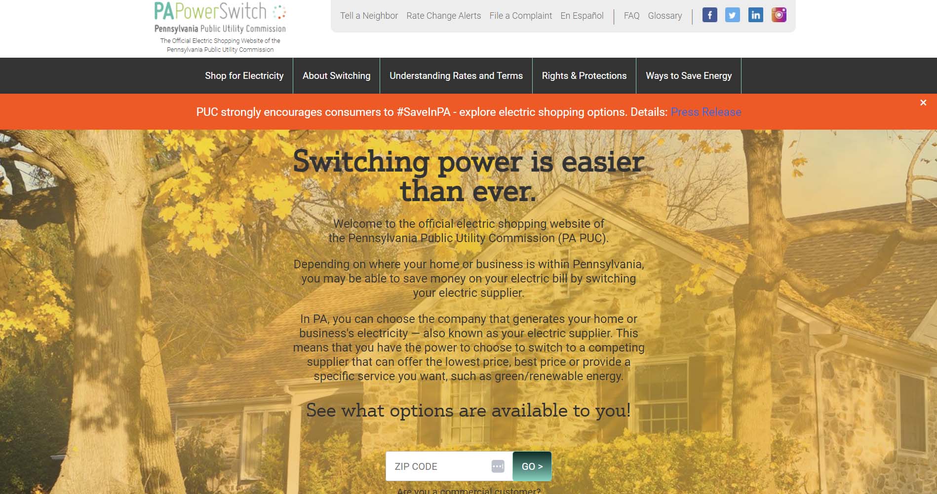
PA Power Switch
PA Power Switch is a website that Pennsylvanians can use to comparison shop for an energy provider. It is affiliated with the Pennsylvania Public Utility Commission. Right on the home page, visitors can enter their ZIP code to find what energy providers are available in their area - which is the website's primary purpose.
The website also features a navigation bar at the top with information that customers will find helpful, including rates, terms, and ways to save energy. Signing up for rate change alerts is also an option to make more informed choices about power providers.
Design Highlights
- Government-backed trust signals are front and center. The "Official Electric Shopping Website of the PA PUC" tagline is repeated in both the header and the footer.
- A zip-code-driven rate comparison tool is the hero element, immediately directing users toward the site's primary utility: shopping for electricity.
- A simple, task-focused navigation with only a handful of top-level sections reduces cognitive load.
- Social proof via a prominently displayed customer count ("1,478,332 Pennsylvanians Have Already Switched") builds credibility.
- A rate change alert sign-up form is integrated directly on the homepage, encouraging passive engagement beyond the initial comparison task.
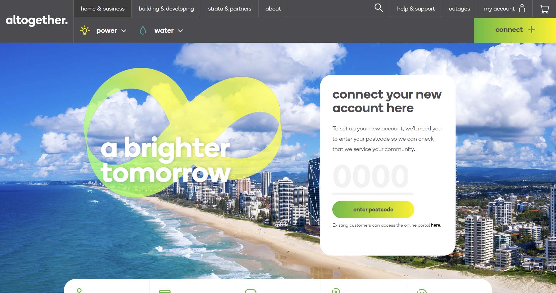
Altogether
Altogether is an Australian utility company that puts its customer portal front and center. As soon as you visit the site, a pop-up asks you to enter a passcode to connect your new utility account. You can also go directly to your account, get help and support, or check for outages using the navigation bar at the top.
The website has a clean, bright design with a vivid green/yellow color bringing it together. It is easy to navigate, with pull-down menus for power and water at the top.
Design Highlights
- Bold, distinctive brand identity built around a vivid green and yellow color palette with large, expressive typography stands out strongly from typical utility site aesthetics.
- A postcode-entry account connection widget is embedded directly in the hero, blending a functional onboarding task into the visual centerpiece of the page.
- Five quick-action tabs below the hero (My Account, Pay My Bill, Direct Debit, Move Out, Outages & Works) keep transactional tasks immediately accessible without dominating the design.
- Service lines (Living, Power, Water) are presented as editorial tiles with lifestyle photography and bold lowercase headlines, giving the site a magazine-like feel.
- A community/fee checker section lets users enter a postcode to view local rates, reinforcing the hyper-local positioning.
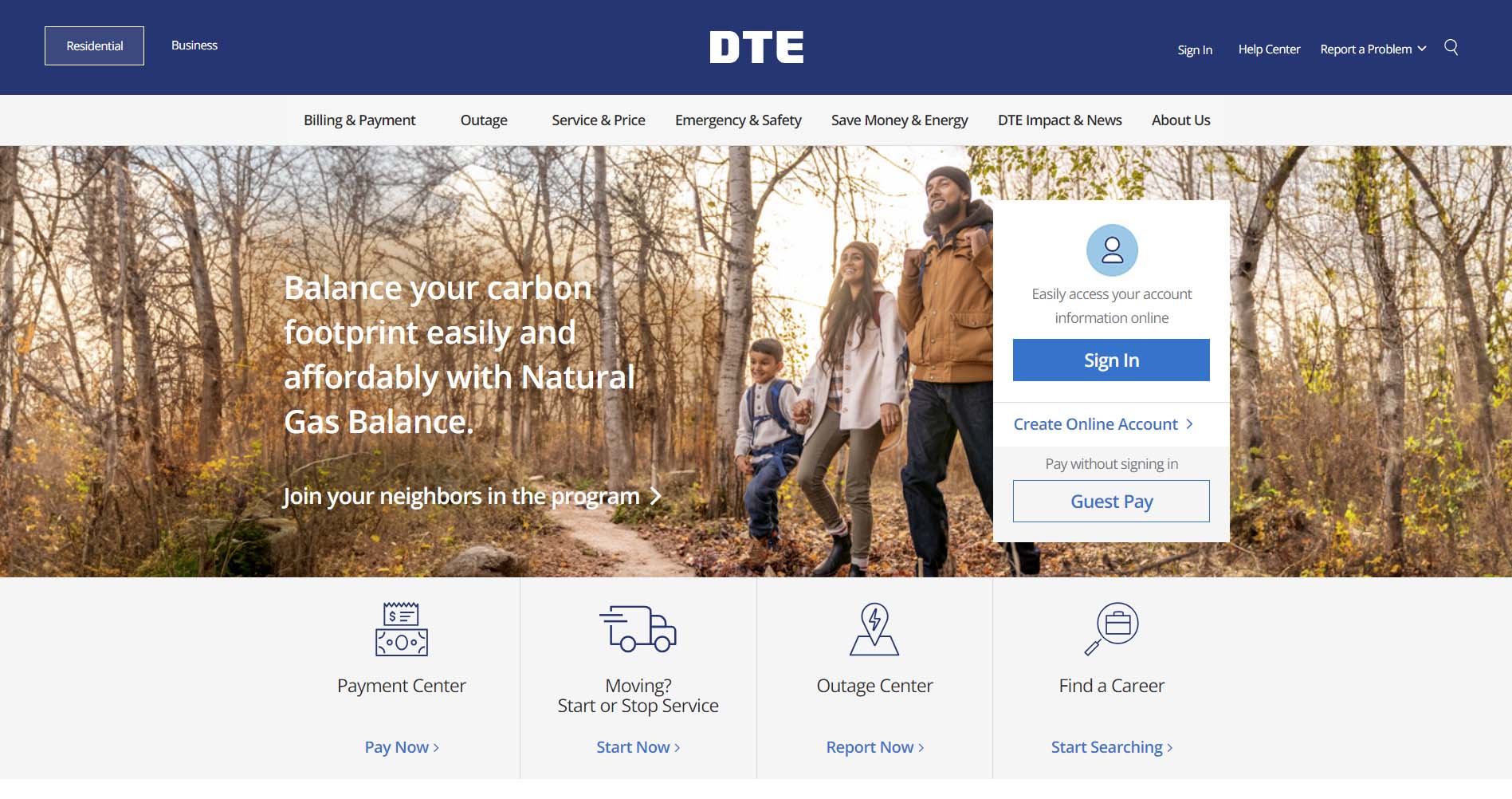
DTE Energy
DTE is a Detroit-based energy company that provides electric and natural gas utilities to consumers in Southeast Michigan. DTE does a great job of keeping their site simple and easy to navigate. The links below the hero on the homepage guide users to four of the most popular pages across the site. The toggle at the top on both desktop and mobile lets users seamlessly switch between the consumer and business sections of the site. The navigation also collapses well on scroll to allow users to continue to navigate to different pages without taking up too much space at the top of the screen.
Design Highlights
- Clear residential/business audience segmentation with separate navigation states for each user type.
- Persistent emergency/safety access with gas leak and outage links always visible in the header across all contexts.
- Rotating hero banners balance promotional content (reliability messaging, natural gas programs) with functional CTAs (sign in, guest pay)
- The "Interactive Home" feature links to an external virtual home tour, which serves as an engaging educational tool embedded in the savings section.
- Quick-action icon tiles (Payment Center, Moving, Outage, Careers) provide fast paths to the most common tasks.
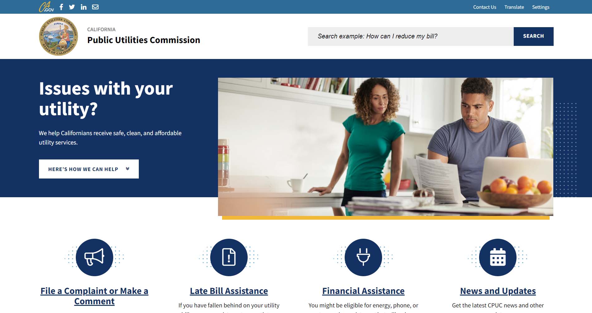
California Public Utility Commission
The California Public Utility Commission (CUPC) is a government agency responsible for ensuring that residents can access clean, safe utility services. When users navigate its website, they will immediately see four graphics that offer ways the CUPC can help. As visitors scroll, they can access additional information, like rate comparisons, drought and conservation info, and wildfires.
Design Highlights
- An accessibility-first design with high contrast mode, font size controls, and a language translator directly in the header.
- Emergency action is immediately surfaced with "Call 911" as the first item in the "How can we help?" sidebar.
- Content is organized by regulatory purpose with clear sections for consumers, industries, news, and proceedings.
- Upcoming meetings and latest news are surfaced on the homepage, keeping the site feel current and transparent.
- The functional, government-standard layout prioritizes information density over aesthetics with minimal clutter.
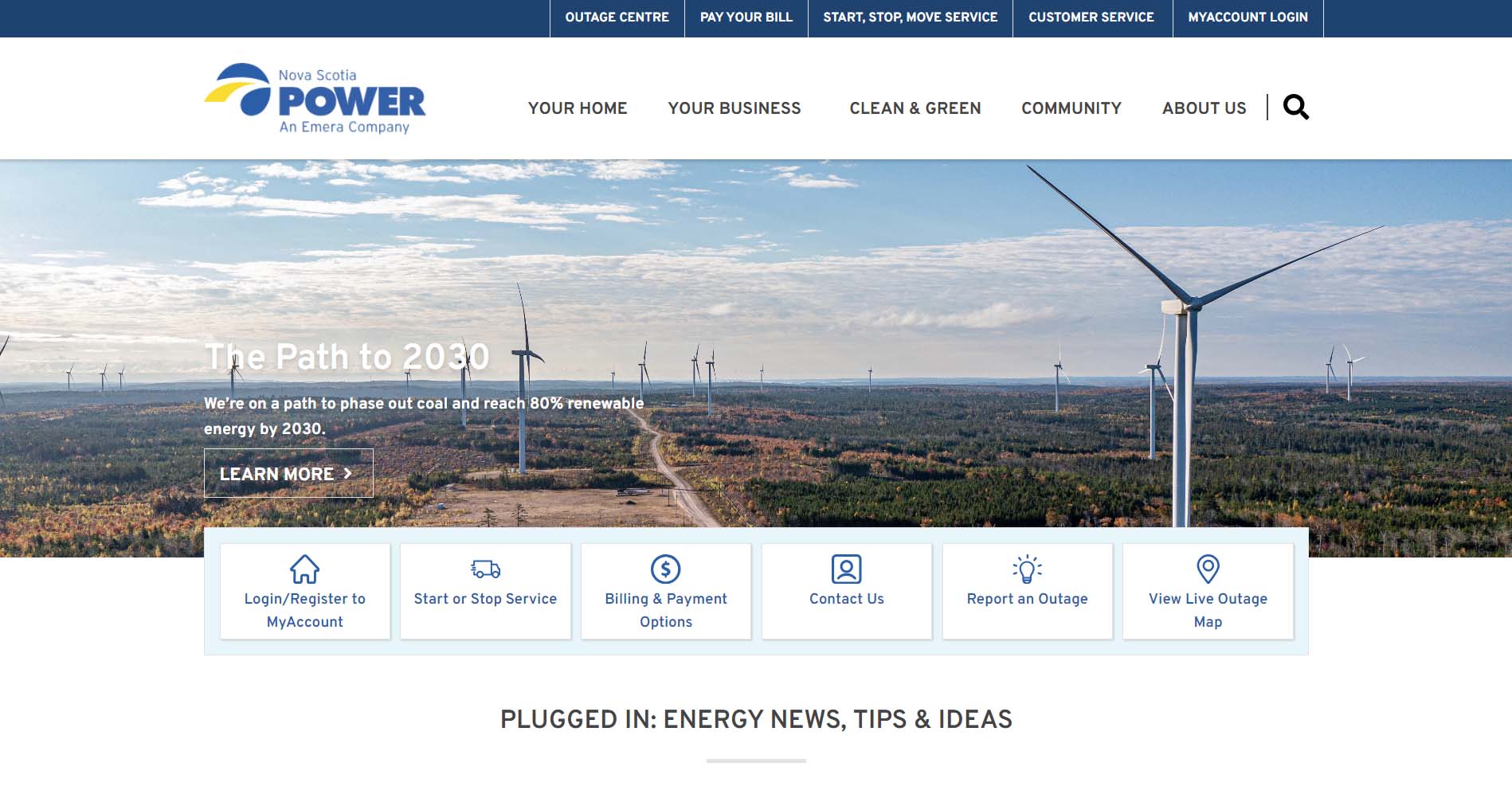
Nova Scotia Power
In Canada, Nova Scotia Power has a simple-to-use website. Right up front, the company highlights its commitment to sustainability with text and a photo of a windmill farm. Beneath the picture, customers can choose from 6 options, including reporting an outage, viewing a live outage map, and starting or stopping service. In addition, visitors can access information specifically for residential and commercial customers at the top.
Design Highlights
- Four persistent quick-link shortcuts in the header (Outage Centre, Ways to Pay, Start/Stop Service, Customer Service) cover the highest-frequency needs.
- "Plugged In" editorial section functions as a content hub by mixing company news, community updates, and CEO communications to build trust.
- Contextual login panel slides out in the header rather than redirecting to a separate page.
- Audience segmentation separates home and business customers cleanly, with a dedicated landlord section and a student section.
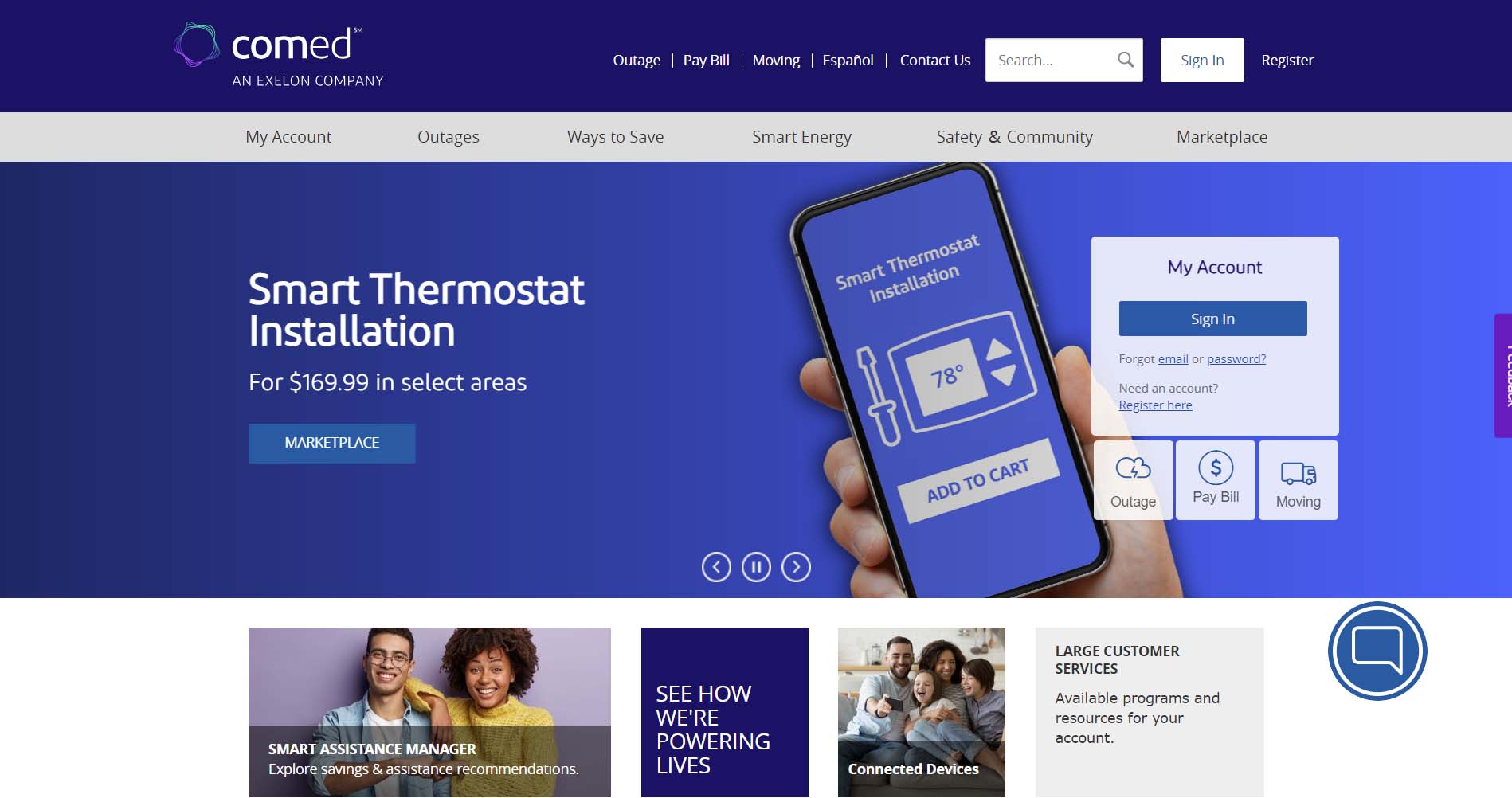
ComEd
The Ed in ComEd stands for Edison. ComEd was one of several energy companies owned by the father of electricity, Thomas Edison. Today, ComEd is the largest electric utility company in Illinois and a Fortune 200 energy company. The site design maintains simplicity to make navigation easy for users. The entire homepage can be digested without scrolling. The design also uses a simple block format to keep content sections visually separated.
Design Highlights
- Deep purple/indigo hero section creates a bold, distinctive brand identity that stands out from the blue and green palettes common across most utility sites.
- Three core task shortcuts (Pay My Bill, Outage, and Moving) are surfaced directly within the hero with brief descriptive text beneath each, combining navigation with contextual reassurance.
- Sign In and Create Online Account buttons are given equal visual weight in the hero, actively encouraging account registration alongside existing user access.
- Language selector (EN) is visible in the top utility bar, signaling multilingual support without making it the focal point.
- A live chat button is persistently anchored in the bottom-right corner, and a feedback tab is fixed to the right edge of the page, which both provide low-friction support access points.
- The secondary navigation bar (My Account, Outages, Ways to Save, Smart Energy, Safety & Community) provides clear content-area wayfinding separate from the utility header links.
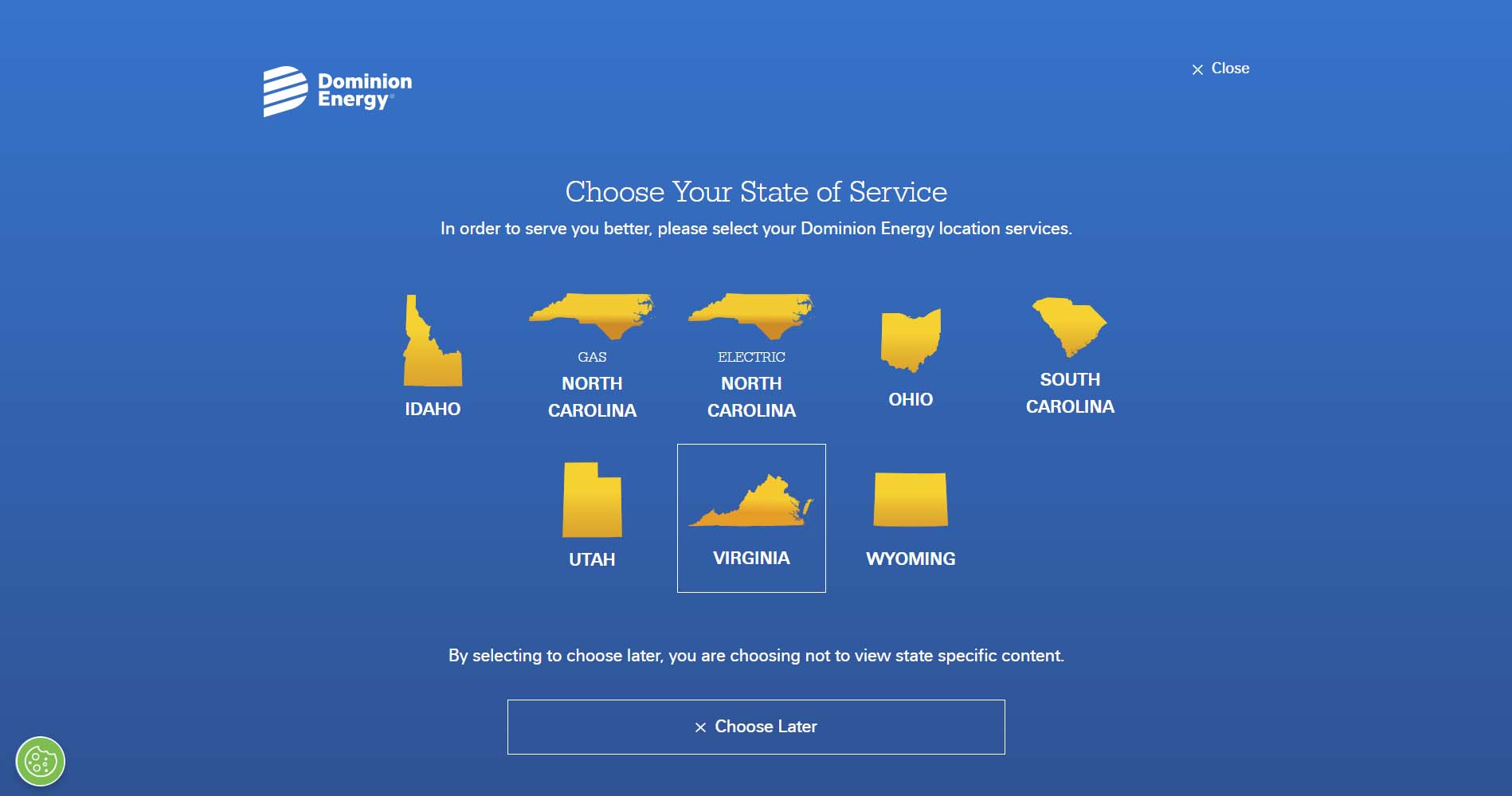
Dominion Energy
Dominion Energy is a utility company that operates in eight different states. Building easy-to-navigate site architecture when operating across multiple states is difficult, but Dominion does this well. The site uses a dropdown in the navigation that allows you to select your location. Your selection will then take you to the proper subsection of the site for your state. A corporation as large as Dominion could easily have confusing navigation, but the designers did an excellent job of clarifying things.
Design Highlights
- State-of-service selector modal appears on first visit to deliver a localized experience across NC, SC, and VA service areas.
- Navigation is organized around customer intent ("Pay My Bill," "Start/Stop or Move," "Outage or Emergency") rather than company structure.
- Mobile app promotion is featured prominently on the homepage with biometric login as a key selling point.
- Storm preparedness content is given homepage real estate, reinforcing reliability and customer care.
- Clean, brand-consistent design with a dark navy/blue color palette and strong hierarchy throughout.

Southern California Edison
Southern California Edison is one of the nation’s largest utility companies. The corporation has been powering Southern and Central California for over 135 years. Like many utility companies featured on this list, SCE keeps some of their most important links below the hero with icons for easy navigation. The nav menu displays five of the most popular pages on the site and keeps all other pages collapsed in a toggle to reduce clutter. The site also offers multilingual support with the language dropdown.
Design Highlights
- Multilingual support is exceptional. The site offers 19 language options in the footer, reflecting the diversity of its Southern California service area.
- Wildfire safety is elevated to a full navigation section and homepage feature, which is highly relevant for SCE's geographic context.
- Dark mode toggle is available foraccessibility.
- Four persistent bottom-of-page quick-action icons (Moving, Outage, Pay Bill, Payment Assistance) are always visible on scroll.
- The Rate Plan Comparison Tool is surfaced prominently under the Save Money section, helping users make informed plan decisions.
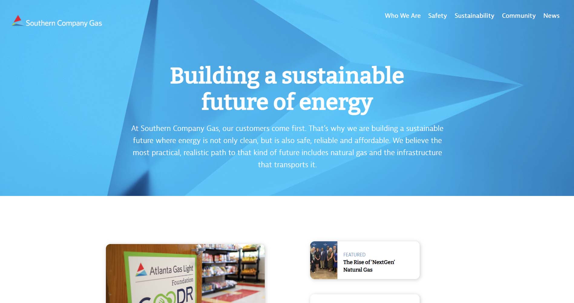
Southern Company Gas
Southern Company Gas is a company that is responsible for providing natural gas to 4.4 million customers throughout the South. Its website focuses on telling a story of who the company is and what its values are. Scrolling down the page, you can find links to its subsidiary companies - like Atlanta Gas Light - with customer portals on their websites.
Design Highlights
- The site is less transactional and more about positioning the company's mission and subsidiaries, which is perfect for a corporate parent company website.
- Navigation emphasizes "Who We Are," Safety, Sustainability, and News, which is appropriate for a B2B/corporate audience.
- "Call Before You Dig - Dial 811" safety CTA is always present in the navigation, which is a smart public safety integration.
- The homepage communicates brand pillars ("We Deliver, We Enrich, We Invest") through an editorial layout with supporting photography.
- Sustainability and clean energy content are prominently featured, signaling corporate ESG priorities.
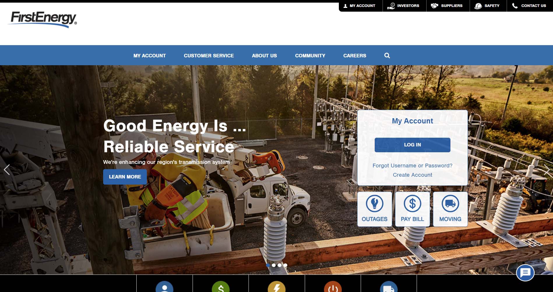
FirstEnergy
FirstEnergy is an electricity provider that has an easy-to-use website. When you land on its page, you will immediately see an option to log in to your account. Underneath are three buttons you can click to report an outage, pay your bill, or get help stopping or starting services if you are moving. These options are repeated beneath the large photograph and are also included in the navigation bar, so that it is as simple as possible for users to find what they need.
Design Highlights
- Sub-company navigation is well handled, with 10 electric company subsidiaries easily accessible from a single nav menu, organized by state.
- Material icon set (Google Material icons) is used throughout for visual consistency on section cards and quick-link tiles.
- The commitment section on the homepage uses icon cards to concisely communicate values: environment, community, corporate responsibility, and grid investment.
- Outage reporting is offered in three ways (online, text, phone), which is good multichannel accessibility.
- The newsroom is prominently linked from the footer and features timely, localized grid improvement stories.

Delaware Electric Co-Op
Delaware Electric Co-Op’s website is one of our designs at Inclind. It’s a great example of using color to create a consistent message. The website uses the brand’s signature colors, dark blue, light blue, and white. This use of color also makes it easy to read and accessible because of its high contrast.
On its home page, Delaware Electric Co-Op has a large button to report or see current outages and a tab on the side to start service. Along the top, you can find a button to log into your account, learn about energy savings, and participate in its “Beat the Peak” program. There is information about how to prepare for a power outage.
Design Highlights
- "Beat the Peak" demand-response program, just below the hero with a cumulative savings counter, is used as a compelling proof point, front and center.
- A tabbed banner below the hero offers three distinct entry points (Save Energy and Money, Be Prepared for Outages, Lower Your Monthly Bill), efficiently routing users by intent.
- A persistent vertical "Start Service" CTA is fixed to the left edge of the page, maintaining a conversion shortcut throughout the scroll experience.
- Energy Savings Tips are laid out as a 2×2 icon-card grid with clean illustrations, making the section scannable and approachable.
- Co-op identity comes through strongly in the news section, which includes community-focused stories, recipe content (a notable co-op tradition), and board governance updates alongside utility news.
- The teal and navy blue color scheme is clean and professional, differentiating DEC from the green/yellow palettes common among sustainability-focused utilities
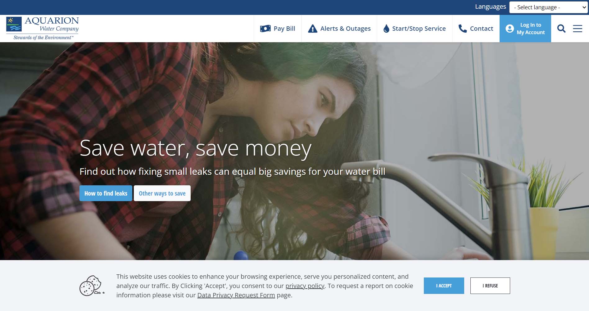
Aquarion Water Company
Aquarion Water Company has a clean, well-designed website. At the top, you can choose from several options, including paying your bill, logging into your account, and starting or stopping service. There is also a large photograph with a button to learn more about saving water. In addition, the site can be translated into several different languages using a drop-down box.
Design Highlights
- Sticky top bar with four ultra-clear shortcuts (Pay Bill, Alerts & Outages, Start/Stop Service, Contact) keeps essential tasks permanently accessible.
- Water quality transparency is a design priority. The lead and PFAS education pages are surfaced prominently in the navigation.
- Community engagement is treated as a content section, including a newsletter, free aquarium tickets, and live Mystic Aquarium cameras.
- A virtual treatment plant tour (YouTube link) is featured on the homepage, building public trust through transparency.
- Live chat is integrated directly on the site with a visible panel, reducing friction for support needs.
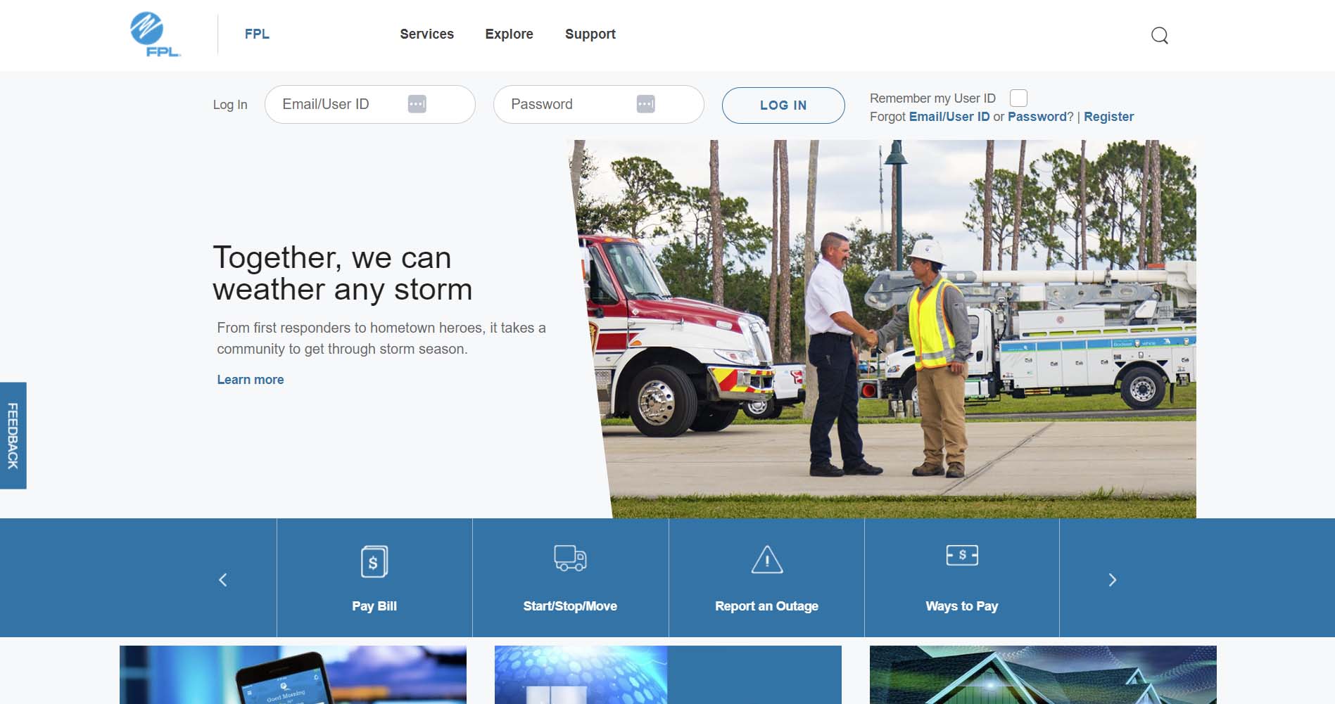
Florida Power & Light
Florida Power & Light (FPL) serves two distinct areas of Florida. To make it as easy as possible for visitors to get the information they need, the site immediately asks which region they want to access. Once visitors make that selection, they are taken to the specific site for that area. At this point, users can log into their accounts, peruse services, and find support.
Design Highlights
- Regional selector upfront cleanly splits FPL vs. FPL Northwest FL customers before they enter the site.
- Extensive homepage quick-link system organized across multiple tabs covers billing, account, outage, and support tasks to surface a wide range of actions without overwhelming the primary layout.
- "Power Tracker" outage map is promoted with direct homepage placement alongside a simple report-outage CTA.
- Financial products like surge protection (FPL Home) and the On Call® savings program are woven into the homepage content as promotional tiles.
- Community solar (SolarTogether®) is highlighted as an inclusive option for renters and non-panel owners.
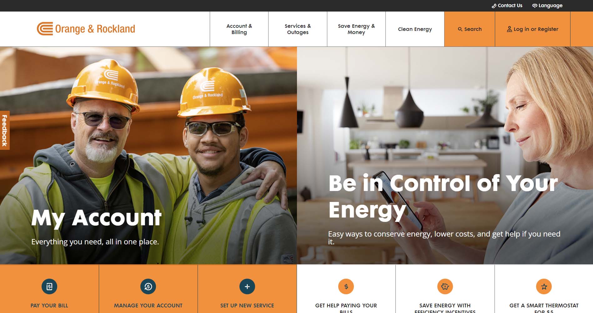
Orange & Rockland
Orange & Rockland makes good use of its signature color - orange - on its website. On the main landing page, two large photographs prompt users to log into their account or learn how to conserve energy. The navigation bar provides additional options, including services and outages. The website can also be translated into different languages.
Design Highlights
- Dual-hero layout splits the homepage into two equal sections: account management and savings, with a clear, balanced content priority.
- Contextual navigation is segmented by audience type: Renters/Homeowners, Small/Medium Businesses, Commercial/Industrial, and Business Partners.
- Clean Energy has its own top-level nav section, with dedicated pages for EV programs and a formal "clean energy commitment" page.
- Outage map and outage reporting are linked together in the same homepage section for quick access.
- Language toggle is easily accessible in the header, supporting the diverse greater New York service area.
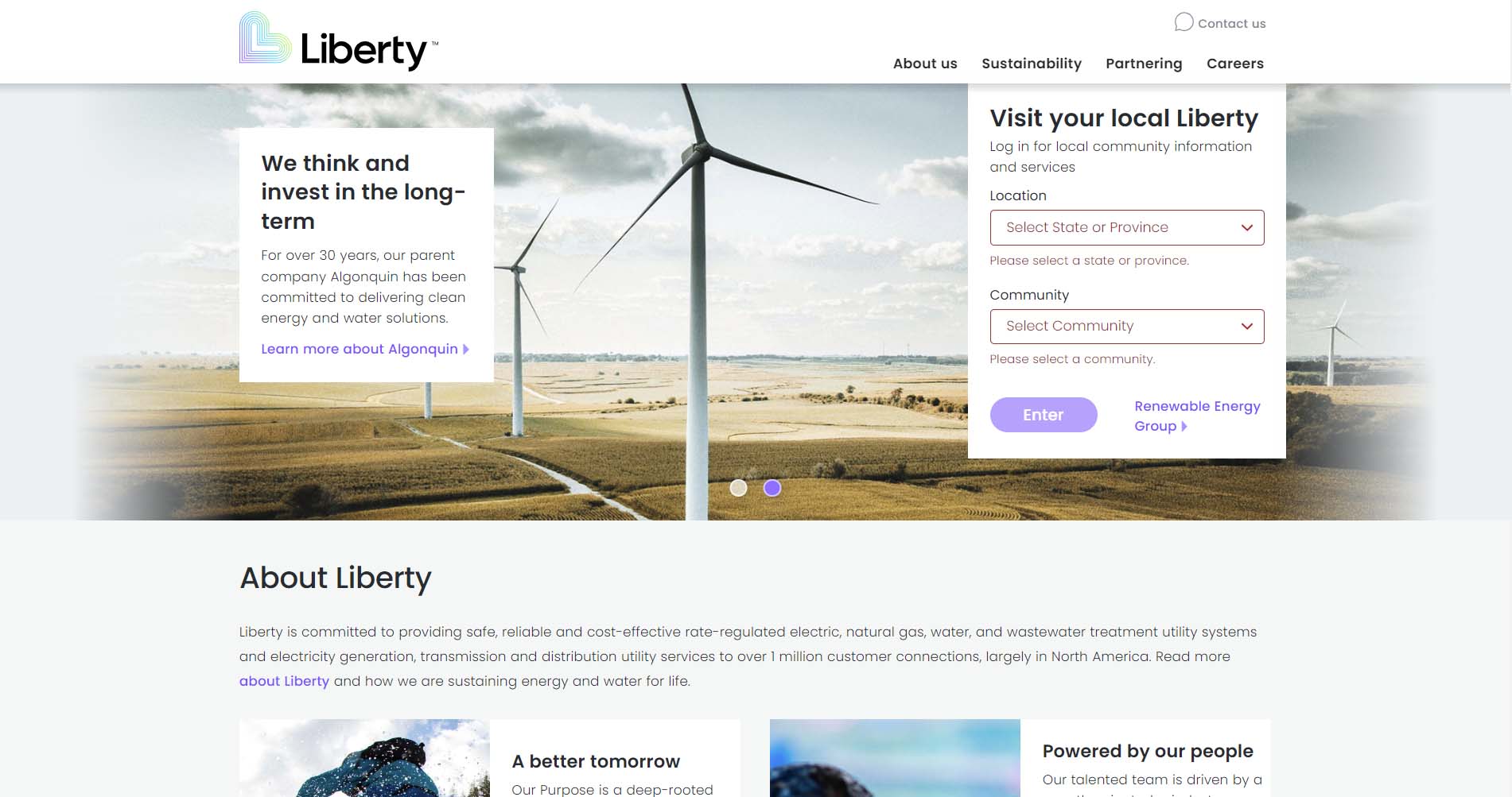
Liberty Utilities
Liberty Utilities recently revamped its website to provide a more streamlined user experience. It starts by asking users to select a region. Once you make your selection, it redirects you to the site for that subsidiary - an excellent option for companies that operate in a number of areas. On the regional pages, the branding is consistent, and users can report an emergency or an outage, log into their account, and learn about smart energy usage.
Design Highlights
- The location and community dropdown selector on the homepage personalizes the experience for a multi-region, multi-service utility.
- Brand messaging is emotionally resonant: "Energy and water for life" and "From the small moments to the major milestones" lead with lifestyle rather than utility.
- The homepage functions as a corporate portal by pointing users to local service sites rather than hosting transactional tools directly.
- Sustainability content connects Liberty's mission to its parent company, Algonquin, reinforcing green credentials.
- Simple, uncluttered design with generous white space and strong photography that feels warmer than most utility sites.

Eagle River Water & Sanitation District
Like many of the utility site examples above, the site for the Eagle River Water & Sanitation District, isn’t flashy, but is incredibly functional. The homepage hero is set to a relatively small height to allow the section for quick links to be seen above the fold. The most frequented pages for users are all included in the quick links section, and a water supply dial can be seen from the homepage to let users know the current status of the water supply. The menu is streamlined without a need for a mega menu, and the “I want to” dropdown helps users navigate based on the action they’re trying to take on the site, which is extremely helpful. To further facilitate navigation, the inner pages feature more quicklinks in the sidebar that change based on the page the user is on.
Design Highlights
- The tagline "Clean Water. Quality Life.™" is placed prominently in the top-left, immediately communicating the mission before any navigation or imagery.
- A full-width landscape hero photo of the Eagle River gives the site a strong sense of place, which is an effective choice for a district deeply tied to its natural environment.
- Five icon-based quick links (Pay My Bill, Water Outages, Conservation, Rates, Boards of Directors) provide clear task navigation just below the hero fold.
- A live "Water Supply Risk" gauge widget displaying risk level from Low to Extreme using a dashboard-style dial is a standout functional design element that communicates urgency at a glance.
- An interactive "Bill Forecaster" tool is prominently promoted, allowing users to model how changes in water use would affect their bill.
- Google Translate integration appears in the top utility bar alongside a phone number, making multilingual access immediately visible.
What a Utility Company Website Should Include
Whether you run an oil and gas company, a water company, a renewable energy start-up, or another type of utility operation, a website is a necessity. Customers and prospective clients expect that they will be able to find a business online. Ideally, they will be able not just to get information from the website but will also be able to pay their bill, start or stop service, and more.
Intuitive & Responsive Design
As an initial matter, a utility company website should have an intuitive and responsive design. In addition to looking great and being visually appealing, your site should function well regardless of the device your customer is using. Navigation should be simple and easy to use, and the website should be fully accessible.
Clean & Clear Layout
User experience (UX) is a key component of website design. Essentially, you want to be sure that your website isn’t cluttered so that the focus can be on content. You can have the most informative, helpful site in the world, but people won't utilize it if it isn’t set up in an easily usable way.
Consistent Messaging
Next, utility company websites should have clear, consistent messaging. This includes your company’s story (such as an energy company focused on customer service or a sustainable future), but the overall branding. Good design can help communicate your messaging using white space, consistent fonts and colors, and visuals.
Self-Service Account Management
One of the most important functions of a utility website is giving customers full control of their accounts without needing to call. Your site should allow customers to pay their bill, view usage history, set up autopay, enroll in paperless billing, and start, stop, or transfer service all online. A guest payment option for users who don't want to create an account is also worth including, as it removes friction for one of the most common tasks.
Rates & Transparency Tools
Customers increasingly want to understand what they are paying and why. Rate comparison tools, bill forecasters, and plain-language bill explainers help build trust and reduce confusion-driven support contacts. For utilities serving deregulated markets, a supplier comparison tool may also be appropriate.
Outage Reporting & Real-Time Status
Customers turn to utility websites most urgently during outages. An interactive outage map, a simple way to report a problem, and estimated restoration times are essential features. Outage text and email alert sign-ups give customers a way to stay informed passively, reducing inbound support volume during high-stress events.
Ultimately, the goal of a utility company website should be to provide the information that customers want and need. Custom integrations can help to achieve this goal, along with a clean, user-friendly design. An experienced website design and development team can help you achieve these goals.
Top Utility Web Design & Functionality Trends
Today's best utility websites have moved well beyond simple bill-pay portals. Across the industry, leading providers are raising the bar with cleaner design, smarter self-service tools, and a stronger focus on customer trust. Here are the key trends defining the best in class:
- Task-First Navigation: The most effective utility sites organize navigation around what customers need to do, not how the company is structured. Top-level menus lead with actions like "Pay My Bill," "Report an Outage," and "Start or Stop Service".
- A customer portal and self-service options: Having a portal enhances the customer experience and also reduces your own labor costs. With a portal, customers can view and manage their account details, check for outages, track usage, and access resources.
- Personalization & Location Awareness: Leading sites recognize that utility customers have highly local needs, and design accordingly. Postcode or zip code entry tools let users access region-specific rates, alerts, and service information. Audience segmentation (residential, business, landlord, student) ensures customers reach relevant content quickly.
- Billing alerts and notifications: When customers sign up for an account, they should input their email and/or phone numbers. You can then ask for permission to send billing notifications and alerts, which will help customers remember to pay their bills - and increase the likelihood that customers will pay their bills in full and on time.
- Auto-pay and online billing: As part of the customer portal, you should have an option for online billing and auto-pay. Many people prefer to pay online rather than write out a check. Giving customers the ability to make payments quickly and easily will benefit everyone.
- Transparency as a Design Feature: Trust is a core challenge for utility brands, and the best sites treat transparency as a design principle rather than an afterthought. Items like water quality reports, emissions data, and infrastructure investment updates are given prominent placement, while bill forecasting and rate comparison tools help customers understand and anticipate their costs.
- Outage maps: When possible, an outage map is an incredibly helpful tool that a utility company should have on its website. This way, customers can easily report an outage and check for service interruptions in their area. This can reduce demand on your customer service team and make it easy for customers to get the information they need.
- Accessibility & Multilingual Support: The most inclusive utility sites treat language access and accessibility as baseline requirements. Language selectors are placed in the global header or footer, and accessibility widgets for font size, contrast, and screen reader support are persistently visible.
- Conservation resources: Whether customers are concerned about the environment or simply want to save money, utility companies can offer helpful tips on how to reduce their consumption of energy and/or water. If your company has a program that offers energy audits, credits for switching to energy-efficient appliances, or another option, this is a good place for it.
- Brand Differentiation Through Design: A growing number of utilities are investing in visual identity that moves beyond the generic. Bold color palettes, expressive typography, and lifestyle photography are replacing the stock-heavy, template-driven look of older utility sites.
Need to Design a Utility Website? We Can Help
Utility company websites are incredibly important to the company’s bottom line and the well-being of the community as a whole. These sites must provide critical, up-to-date information and allow customers to get the needed services. Our website design and development agency can work with you to build a beautiful, functional, and secure utility company website.
At Inclind, we offer a full range of web development and design services for utility companies. We know how vital these sites are to our clients and their customers, so we strive to make them as effective and efficient as possible. Our services include everything from website design and redesign to accessibility audits to custom integrations.
We're available if you’d like to learn more about our web services for utility companies. You can fill out our online contact form or hit the live chat button to talk to one of our experts about your website.
Modern Websites for Modern Utilities
Connect with customers through a smarter, more reliable digital platform.
Let's turn your website into a customer service tool, not a support headache. We've done it for utilities across the country. You're next.
Utility Web Design FAQs
What pages should a utility company website include?
At a minimum, a utility website should include a homepage, account login and registration, bill payment, outage reporting, rates and billing information, service start/stop, and a contact page. Most utility sites also benefit from dedicated sections for energy savings, financial assistance, and safety. The goal is to cover the full range of tasks a customer might need to complete without having to pick up the phone.
How important is mobile responsiveness for a utility website?
It's essential. A large and growing share of utility customers access their accounts and report outages from a smartphone, often in urgent situations. A site that doesn't function well on mobile creates unnecessary friction at exactly the moments customers need help most.
What is the most important feature of a utility company website?
Self-service account management is consistently the highest-priority feature. Customers expect to be able to pay their bill, view usage, and manage their account online at any time of day without needing to call. A smooth, reliable account portal reduces support costs and improves customer satisfaction.
How should a utility website handle outage information?
Outage reporting and status tools should be easy to find from anywhere on the site. An interactive outage map, a simple way to report a problem, and an option to sign up for text or email alerts are the three core components of effective outage communication.
Should a utility website include financial assistance information?
Yes, and it should be prominently placed rather than hidden. Many customers visit a utility website specifically because they are struggling to pay their bill. Surfacing payment assistance programs, budget billing options, and income-qualified discounts on the homepage or in a clearly labeled section helps the customers who need it most find help quickly.
How can a utility website build customer trust?
Transparency is the most effective trust-builder. Publishing water quality reports, infrastructure investment updates, real-time outage data, and plain-language bill explainers signals that your company has nothing to hide. A clean, professional design also plays a role. A dated or cluttered site can undermine confidence even before a customer reads a single word.
How many languages should a utility website support?
At a minimum, a utility website should support the primary languages spoken in its service area. Even a basic Google Translate integration is better than offering no multilingual access at all. Utilities serving diverse urban communities may need to support five or more languages to ensure equitable access to essential services.
What role does accessibility play in utility website design?
Accessibility is both a legal consideration and a customer service one. Utility services are essential for everyone, so your website should be usable by people with visual, motor, or cognitive disabilities. This means following WCAG accessibility guidelines, offering font size and contrast controls, and ensuring the site works with screen readers.
How often should a utility company update its website content?
Time-sensitive content, such as outage alerts, water shortage notices, rate changes, and seasonal safety tips, should be updated as soon as circumstances change. General content like billing guides and service information should be reviewed at least annually. A news or blog section is a useful way to keep the site feeling current without requiring a full content overhaul.
What makes a utility website stand out from the competition?
The best utility websites go beyond basic functionality to offer tools that genuinely help customers. Things like interactive bill forecasters, rate comparison tools, energy usage dashboards, and community solar sign-ups. Strong visual design, a clear brand voice, and content that treats customers as partners rather than just account numbers all contribute to a site that stands out in an industry where the bar has historically been low.