


In the not-too-distant past, if a person wanted to make an appointment with a doctor or therapist or to learn more about available healthcare services, they’d have to pick up the phone book and make some calls. Today, consumers generally expect that most information will be readily accessible with just a few clicks. This creates an expectation that your healthcare practice will have an easy-to-use website that contains any necessary information.
Having a well-designed healthcare website is a great way to increase credibility. It can also bolster marketing efforts and attract new patients. But for many healthcare companies, it can be hard to know where to start. We’ve collected over 25 examples of healthcare services with great websites to inspire you.
At Inclind, we offer a range of web design services, including build-outs, redesigns, and accessibility audits. Our goal is to make your website beautiful, well-organized, simple to navigate, and accessible. Reach out today to learn more about how we can help your business grow.
Why Is Healthcare Website Design Important?
There are a lot of good reasons to have a website for your healthcare practice. Research shows that the majority of consumers (76%) check for a company’s online presence before making an in-person visit. This includes services such as healthcare.
Having a website gives you credibility, and it makes it easy for patients to access information 24/7. It may also cut down on some issues that crop up repeatedly through the use of a FAQ section or offering directions to your location.
Of course, it isn’t enough to just have a website. The site should also be well-designed so that visitors can easily access the information that they need. It can also be a way to expand your marketing efforts by maintaining brand consistency.
A well-designed website can also encourage confidence in your practice and your professionalism. An outdated, hard-to-navigate, or inaccessible site might have the opposite effect. For this reason, it is important that your website is accessible, easy to use, has good information, and is functional.
25+ Examples of Great Healthcare Website Design
Building a website can feel overwhelming. Beyond providing necessary information like how to make an appointment, you need to figure out how to design the site to make it functional, accessible, and attractive. One of the best ways to figure out how to accomplish those goals is by looking at other healthcare websites.
Below, we list over 25 examples of healthcare sites that work really well. These websites are sure to provide information and ideas for building out your own site.
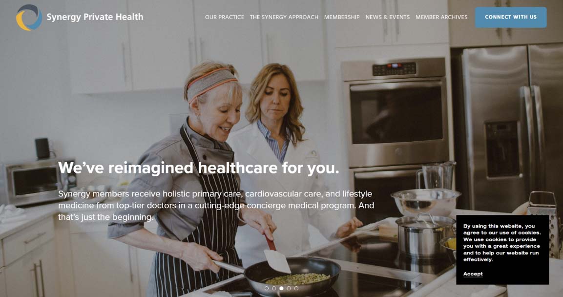
Synergy Private Health
Healthcare websites are often fairly sterile, presenting the necessary information without humanizing it. Synergy Private Health - a membership-based holistic healthcare service - does a good job of making its services seem both relatable and welcoming. They use bold photos of real people throughout their website to achieve this goal.
The copy on the website is also very conversational, which comes across as less formal than many healthcare websites. If you run a smaller practice, this approach might be a good fit for your business.
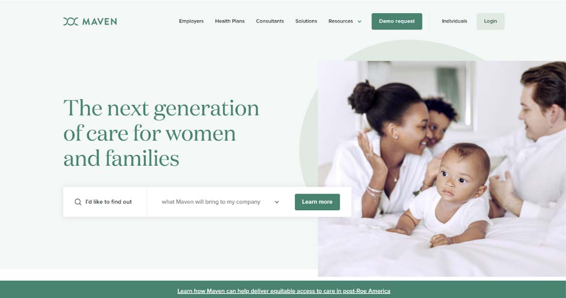
Maven
Maven is a healthcare service that bills itself as the next generation of care for women and families. Its website matches its mission, with soft green colors and welcoming photos of babies and families. It also offers a cool search bar feature that includes a simple drop-down menu that helps visitors get to the section that they want to view.
Maven is also careful to provide important information right up front, such as access to women’s healthcare in a post-Roe America, and how its services can benefit a diverse array of patients. As you scroll through the home page, you will also get a peek at the Maven app, which is a smart way to showcase how helpful your services can be.
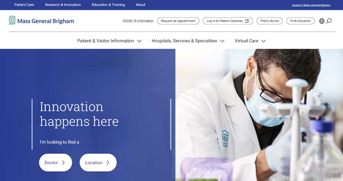
Mass General Bringham
For hospitals, it can be hard to set yourself apart from the crowd, particularly if you’re in a market with a lot of competition. Mass General Bringham uses a smart tactic to differentiate themselves: they highlight their numbers (such as the number of providers, amount of research activities, and the number of patients cared for annually).
In addition, Mass General Bringham makes it easy to navigate their site. Under a heading that asks “How Can We Help,” there are buttons to get care now, plan for the future, and manage your care. This makes it easy for people to get to what they need on the site.
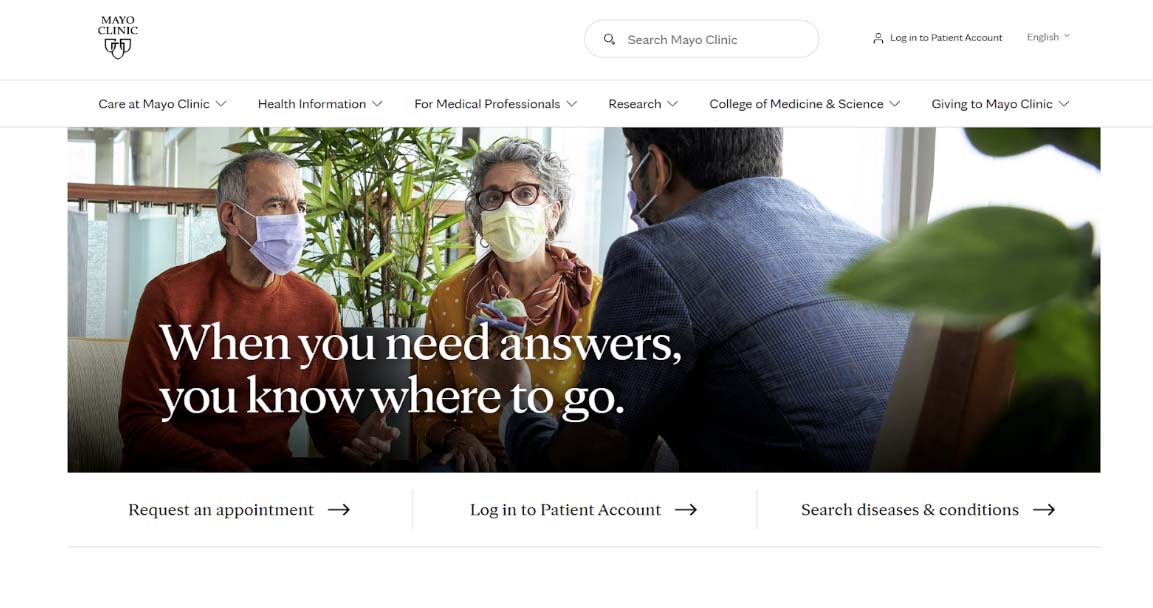
Mayo Clinic
For any business, including healthcare, it is important to help prospective patients understand why you’re the right choice. Mayo Clinic’s website does a good job of concisely explaining why you should choose their hospital directly on their front page. The website asks “Why choose Mayo Clinic,” and then provides four short, direct answers immediately.
Mayo Clinic also does a great job of providing healthcare information. While many smaller hospital systems or healthcare practices can’t compete with their voluminous medical information, this website offers a good example of how you can provide information relevant to your practice.
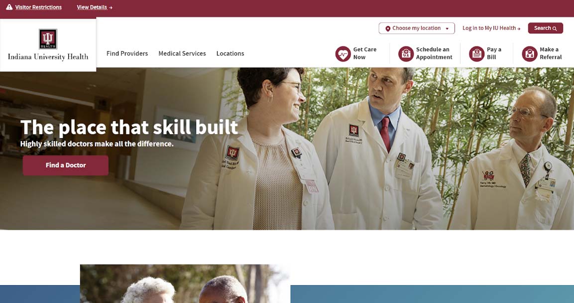
IU Health
Indiana University Health (IU Health) provides something that many healthcare websites do not: a robust keyword search feature. In addition to providing search results for keywords (such as dermatology), the IU health site allows you to see your recent searches and offers filters. In this way, you can limit the results to what you actually want - such as providers or locations, rather than ALL information about a particular topic.
The IU Health website is also well-organized and features the university’s bold maroon color. If you want to get care now, schedule an appointment, pay a bill, or make a referral, you can do so with a click of a button. There is also a login link right at the top of the screen so patients can access their information quickly.
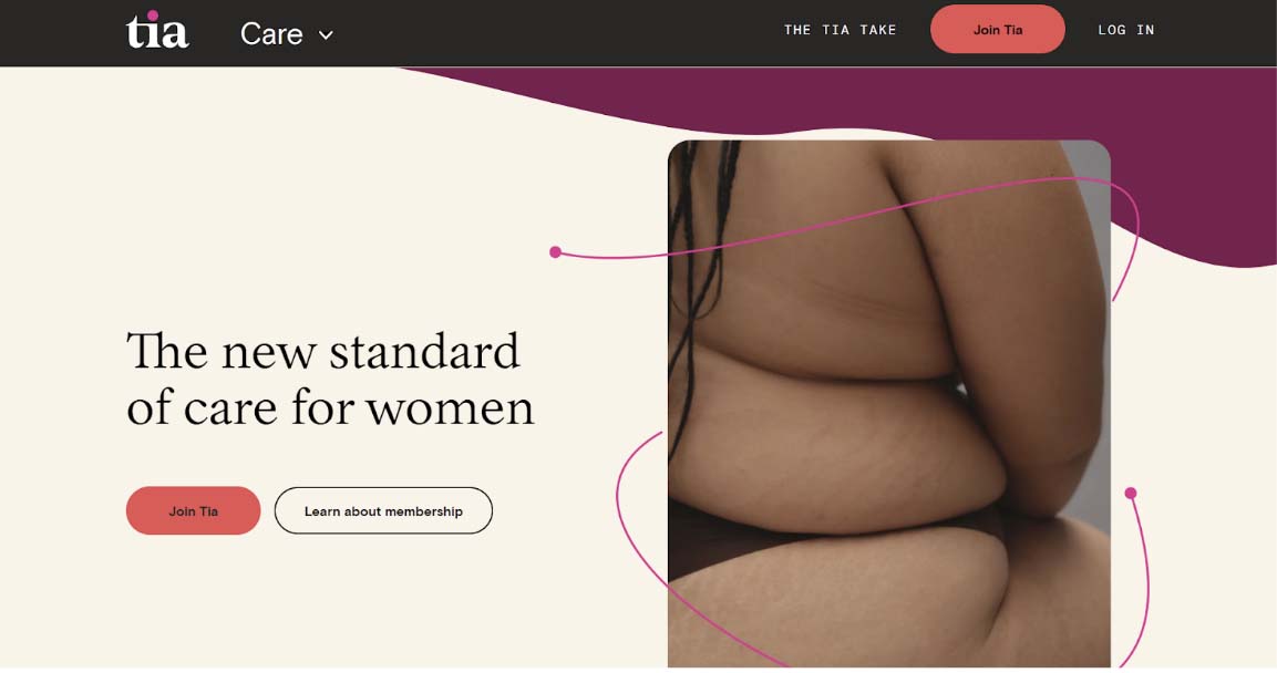
Tia
Tia is a healthcare service designed for women that offers comprehensive care for physical, mental, and reproductive health. The service is unique because instead of visiting separate doctors that could be at different practices or hospitals, you receive a more holistic, comprehensive approach to treatment.
Tia’s website is a great example of how you can use design to further your branding. Tia uses colors in the peach family to show that it is warm and approachable. They also use simple, doodle-like graphics to explain their services and how they are different. Crucially, Tia includes a text explanation for any graphics to ensure accessibility.
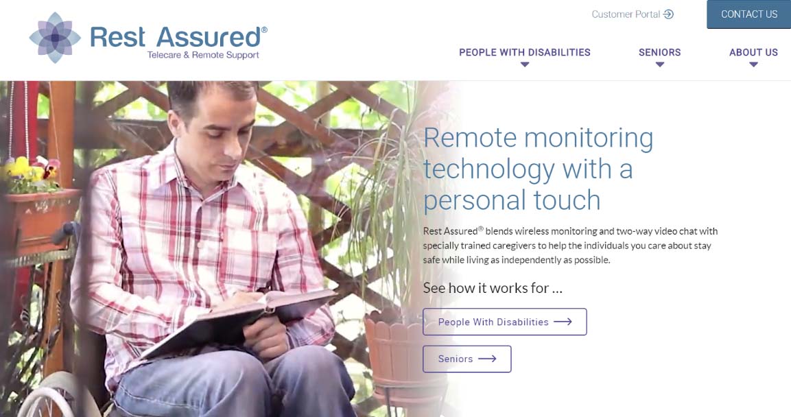
Rest Assured
Website accessibility isn’t just a legal requirement - it is also a smart business decision. Rest Assured, a company that provides telecare and remorse support, offers an outstanding example of how you can build accessibility into your website. Accessibility is particularly important in the healthcare industry, where many of your potential consumers may have disabilities or limitations that may make it difficult to navigate a website.
Rest Assured uses large, high-contrast fonts. They also offer keyboard navigation so that you can get around the site even if you can’t use a mouse. They also use alt text on all images for screen readers and other technology.
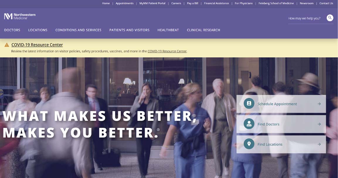
Northwestern Medicine
Northwestern Medicine’s website is visually appealing, featuring the associated university’s school colors of purple and white. The purple is deep enough that it provides a good visual contrast to the white text. It also has a navigation bar up top that allows for ready access to the information and services that visitors may need.
This site also is a good example of how to provide clear guidance on current COVID-19 policies. Although we are several years into the pandemic, most healthcare facilities still have some restrictions - such as the use of masks - and are still treating patients who contract the virus. Northwestern Medicine’s website features a prominent COVID-19 resource center, with information about testing, vaccination, current treatments, and policies for appointments and visits.
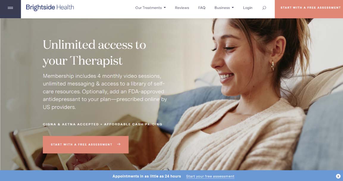
Brightside Health
While many people get into the healthcare field to do good, the reality is that it is also a business. It’s important to keep that in mind as you design your website, as you will want to ensure that visitors to your site can easily make an appointment. Brightside Health offers a good example of exactly how to do that.
The online therapy provider uses the same language in its call to action (CTA), which it puts in a button with a distinct peach color at the top right and the center of the page. Clicking this button starts the process to set up an appointment online - something that many patients prefer to do. If you offer a way to schedule appointments online, consider the Brightside Health website as inspiration for how to make sure that this information is prominent and consistent.
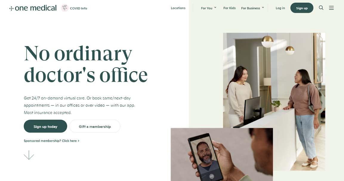
One Medical
When it comes to marketing, knowing your audience is key. Most healthcare practices are aimed at a broad audience of potentially everyone in the community. However, if you have a more specialized practice, then you may decide to follow One Medical’s lead.
One Medical offers 24/7 virtual care on-demand. Their target audience is younger people who are more comfortable with things like scheduling a same-day appointment over video rather than calling to make an in-person appointment. The website caters to its core demographic with a clean white background with green text, simple graphics, and a more modern look.
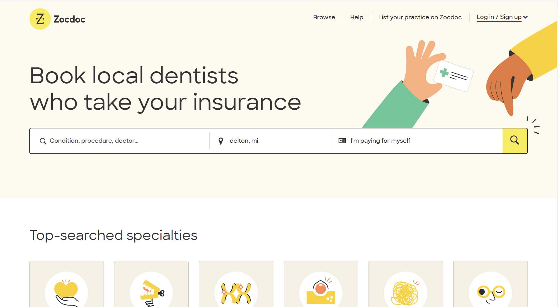
Zocdoc
Zocdoc isn’t a healthcare provider and instead serves as a directory for healthcare providers. The site helps users find local care providers that accept the insurance they have. The hero of the homepage makes their service very clear. There are input boxes up top for users to input the service they’re looking for, the city they’re in, and the insurance they have. An illustrated hand points to the search button to guide the user’s eyes to the desired call to action.
The flat design illustrations look great and are very welcoming. All of the illustrated people on the homepage carry a smile on their faces. The bright yellows and greens used in the design are eye-catching. The directory map is also easy to use with on-site booking capabilities and distance from the search location displayed. The site also collects and displays verified patient reviews to provide users with trust signals.
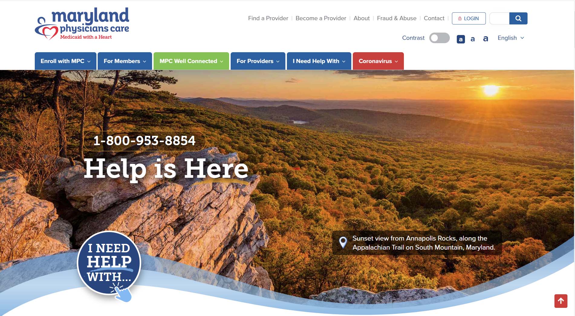
Maryland Physicians Care
Maryland Physicians Care is a managed care organization that provides healthcare services across Maryland to HealthChoice enrollees. The site is very easy to navigate and animated statistics on the homepage keep users engaged as they scroll. We really like the animated “I need help with…” button. When you click the button, you’re directed to a page of the most useful links on the site. You can find help and information for finding a provider, reviewing your benefits, scheduling virtual appointments, and more.
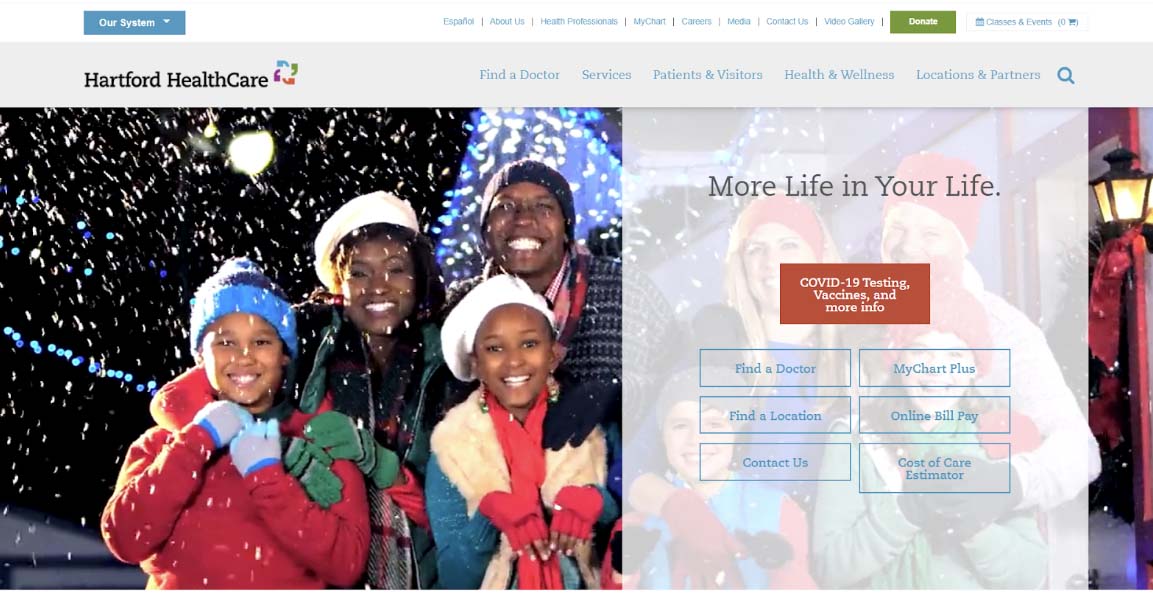
Hartford Healthcare
Hartford Healthcare’s website makes an immediate visual impact. When you navigate to the main page, there is a great graphic of families enjoying themselves doing something healthy and fun. Currently, the image is of two families bundled up in warm clothing, together in the snow. On top of this striking visual is a transparent menu that allows visitors to choose the most commonly visited pages on the site, such as “MyChart,” “Find a Doctor” and “Online Bill Pay.”
The current image on this website does have motion, which can be challenging for people with some types of disabilities. If you plan to use a video or a similar graphic, make sure that it can be stopped or paused, and that there is an image description or alt text available.
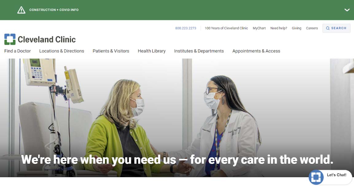
Cleveland Clinic
Cleveland Clinic offers a good example of how healthcare websites can cater to both existing and prospective patients. It can be tempting to think of your healthcare website as a place to attract new patients, but it is also important to meet the needs of your current patients. Cleveland Clinic’s website does a good job of meeting both goals.
The navigation bar at the top of the screen gives several clear options, including “appointments and access” and “locations and directions.” Its chatbot offers a general introduction as well so that visitors don’t think that they can only use it for a specific reason. The website also plays key information in several prominent locations to make it easy to find what you need.
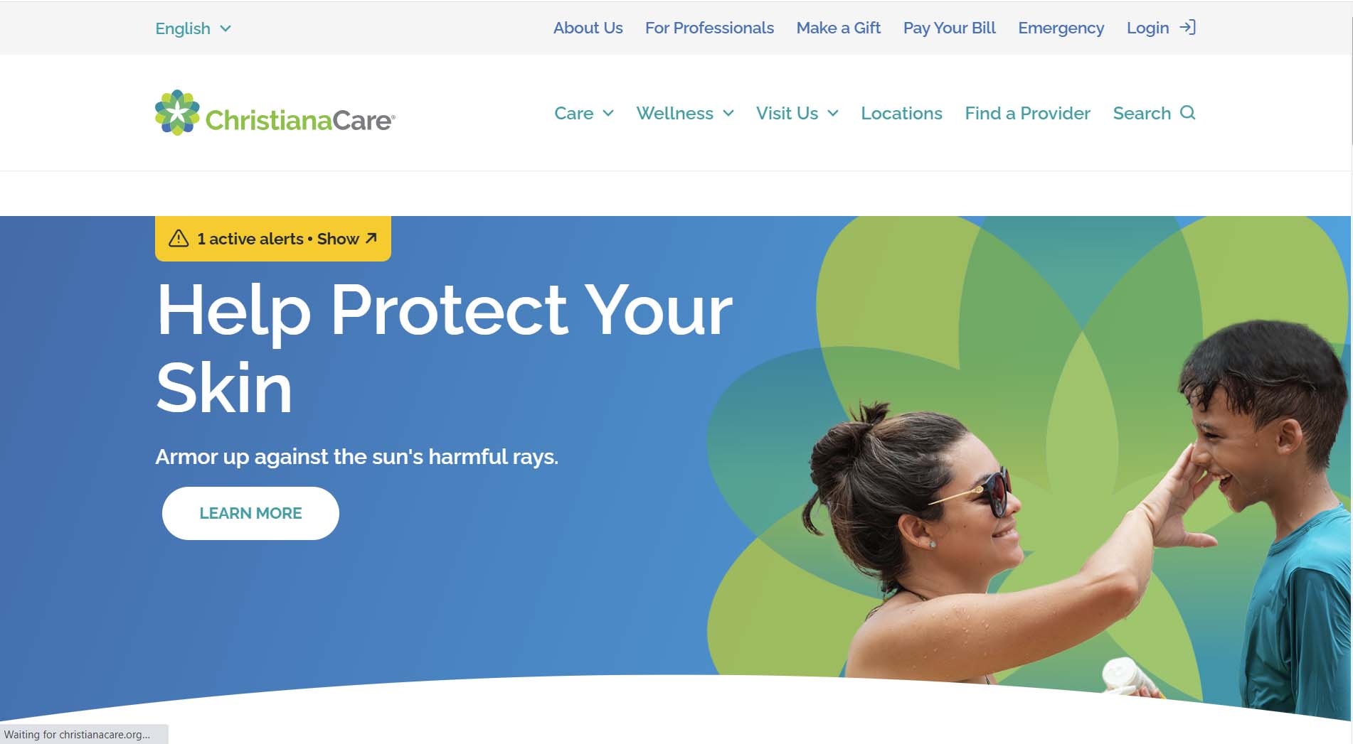
ChristianaCare
As a Delaware web developer, we love to show support for local Delaware organizations. ChristianaCare is one of the country’s largest healthcare providers and they’re based out of Wilmington, Delaware. The layout and design are very simple, which makes the site easy to navigate. The use of larger font sizes helps users of all different vision levels easily read and process site content.
We love the use of an alerts tab in the hero to alert all users of important information and changes. We also like the section on the homepage that divides and presents important pages for both patients and caregivers.
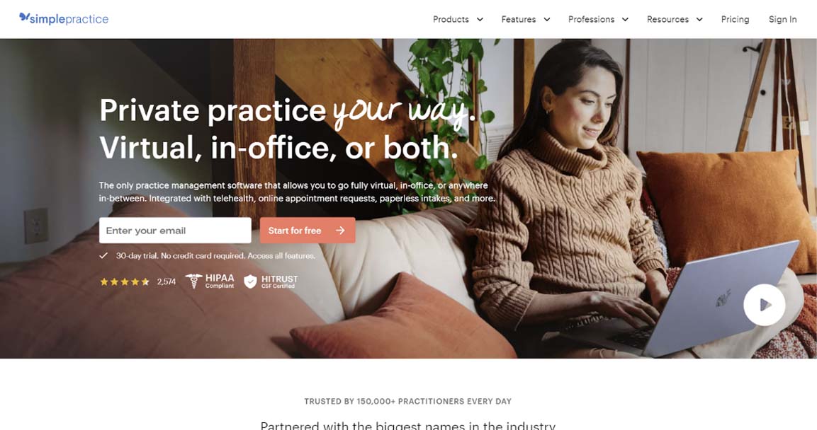
Simple Practice
Simple Practice is not a healthcare provider, but a company that provides practice management software for medical professionals. Nevertheless, its website offers an excellent example of how you can use customer reviews and other critical information to build trust.
We are all used to shopping for goods and services online, and most people are savvy enough to look for reviews. Simple Practice puts its reviews front and center to show that they are highly rated. They also put two logos to demonstrate that they are HIPAA compliant right next to the reviews. The review button is clickable, and it takes you right to a page where you can read the reviews for yourself.
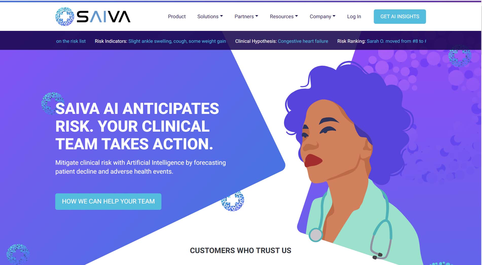
Saiva AI
It’s hard to escape AI these days. The technology has made its way into just about every industry and healthcare is no exception. Saiva AI provides AI software that can analyze patient health records to identify patients with the greatest risk for clinical decline. The hero of the site really pops with the bold, colorful healthcare provider illustration. The use of gradients and the Saiva logo throughout the homepage create visual interest while helping to further establish the brand. The call-to-action buttons are also very clearly differentiated from the rest of the design and well-dispersed throughout the content.
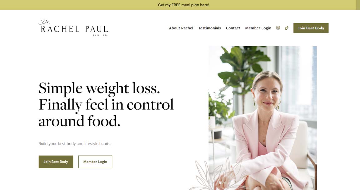
Dr. Rachel Paul
Dr. Rachel Paul is a nutritionist with a sizable social media following. In 2023, having a presence on apps like Instagram and TikTok can be a real boon for healthcare professionals (although it certainly isn’t for everyone). Dr. Paul’s website capitalizes on her online popularity by linking directly to her social media accounts. She also links to her media features using the logos of the media in question.
Not every healthcare professional has an online following, but if you do, then linking them to your website is a smart strategy. It helps to create a cohesive brand identity, which can help with your marketing strategy. It also establishes trust among patients, particularly for younger people who value social media more.
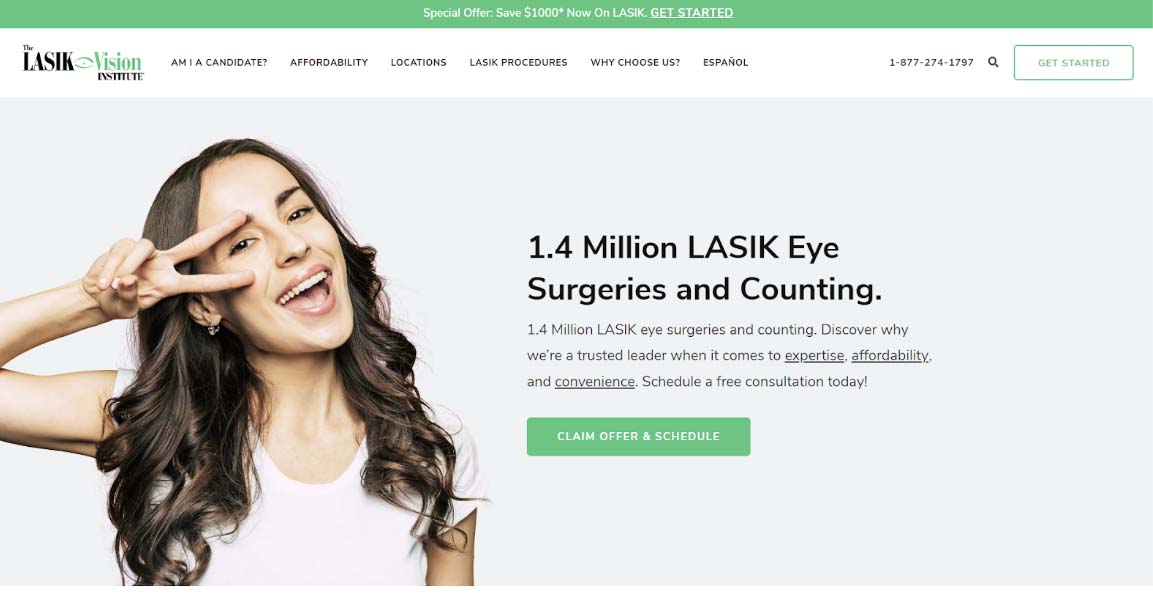
The Lasik Vision Institute
Many people who visit your website may already be patients of your medical practice - but many may simply be exploring their options and can be considered potential patients. The Lasik Vision Institute, a national chain, does something that every healthcare website should consider - they make it as easy as possible to find their locations. This is particularly important when you have more than one location, but is also useful even if you have a single office.
In addition to a prominent “find a location” button, this website also has a “get started” button located at the top corner of the screen. Having a dedicated button like this can help to ensure that people can start the process of becoming new patients as easily as possible - which can increase your conversion rate.
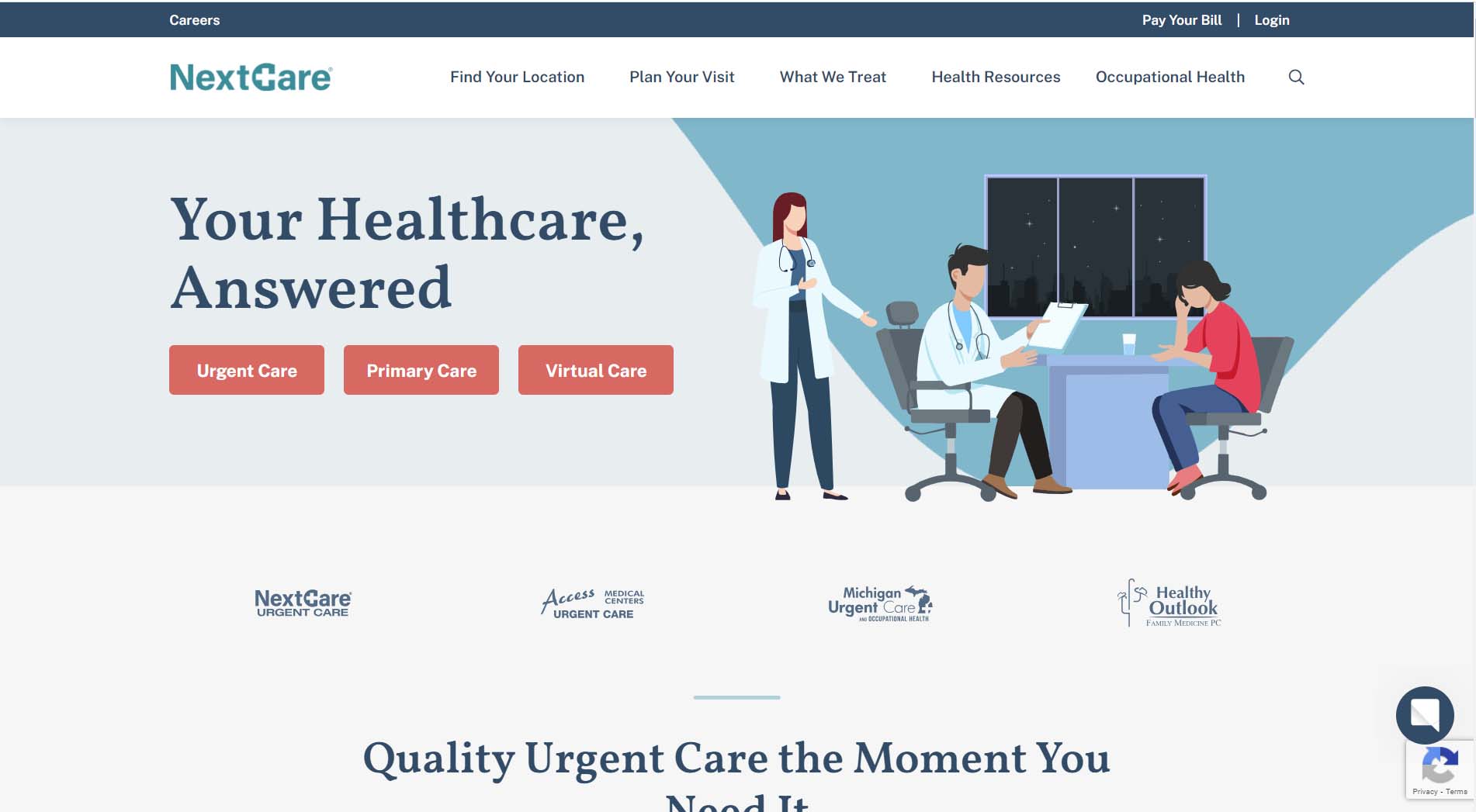
NextCare
NextCare is one of the country’s largest urgent care providers. The company’s site design emphasizes the sense of urgency with urgent care. The hero contains buttons for finding an urgent care location, selecting a primary care provider, or scheduling a virtual care appointment so that you can find and speak to a healthcare provider quickly. The stylized icons for benefits and services pair well with the brand. The design utilizes white space effectively and the splotches of color add visual interest to keep the content from feeling too block-based.
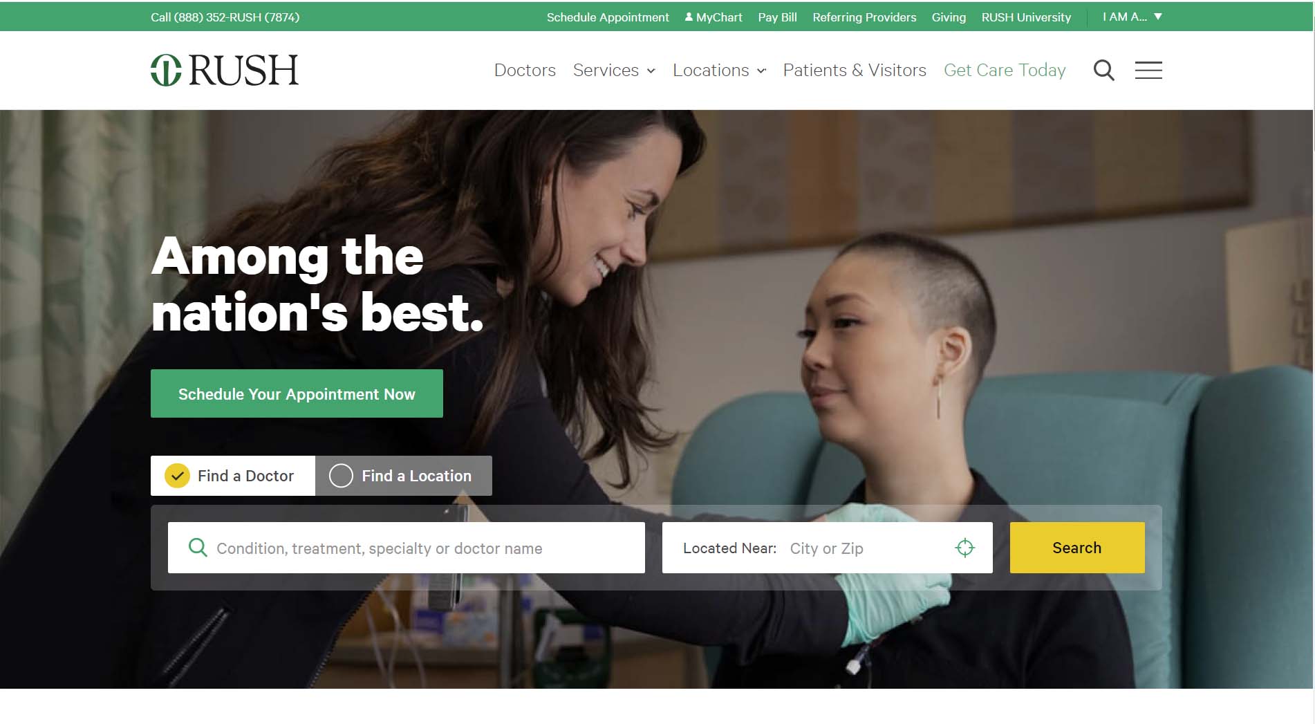
Rush University Medical Center
Rush University Medical Center is an academic health system based out of Chicago, IL with locations throughout the suburbs of Chicago. The layout of the site is very clean and organized. We love the icons added to the mega menu to provide some visual interest to the menu. The header has a drop-down for user type that you can select. You have the option to select whether you’re a patient, visitor, healthcare professional, or job candidate. Based on your selection the site will then recommend relevant links you may be interested in visiting.
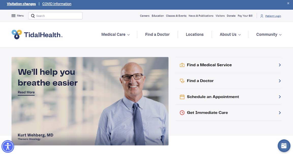
Tidal Health
This site design is one of our own at Inclind. We partnered with Tidal Health to create a new design that would also be ADA compliant. The redesign of the homepage made it easier for patients to navigate to where they needed to go throughout the site with all of the services linked on the homepage. The hero highlights the main actions patients tend to take with links for finding medical services, finding a doctor, scheduling an appointment, and receiving immediate care.
Tidal Health has several locations and service offerings the biggest win with the new design was creating a layout that factors in filtering for a more straightforward approach to finding a provider.
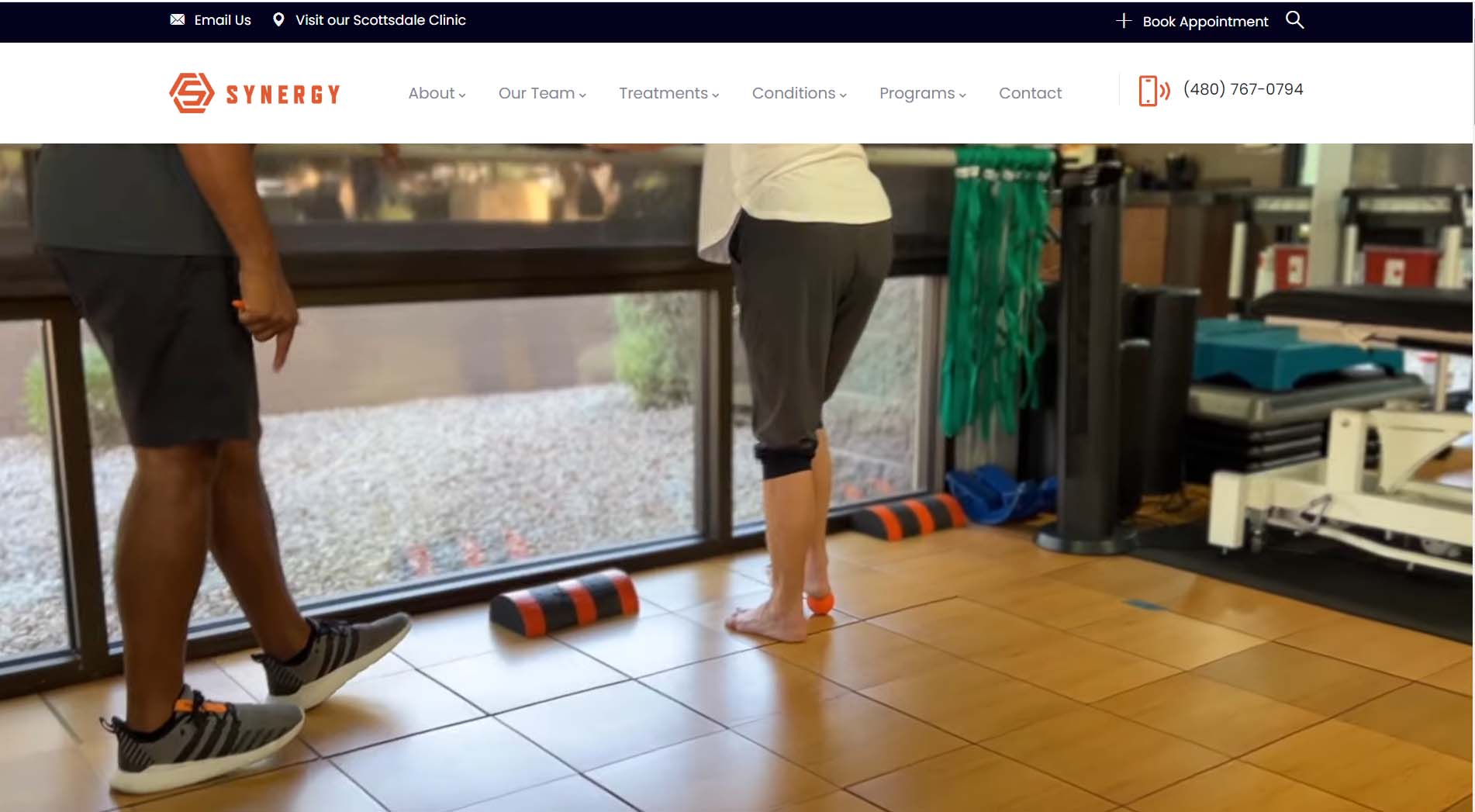
Synergy Physical Therapy
Sustaining a physical injury can be a difficult hurdle to overcome. It’s easy to feel down when you can no longer enjoy the freedom of movement you used to be able to. The Synergy site design keeps things positive. The hero video showcases both staff and patients smiling and laughing. The bright orange color from the logo is incorporated throughout the page, which keeps the design feeling light and bright. The site is also very easy to navigate.
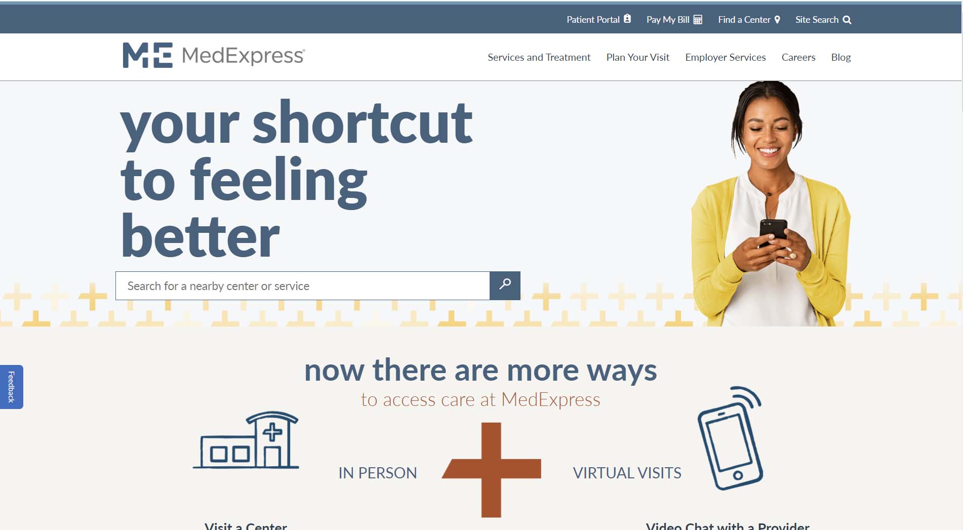
MedExpress
MedExpress is one of many fast-growing urgent care brands. The site utilizes a modern, flat, block layout. The nav bar provides all of the links users need to navigate throughout the site. There are links to access the patient portal, pay bills, and find a nearby center. We love the use of mega menus to display all of the dropdown links on a desktop. The block layout provides a very responsive design that also looks great on mobile.
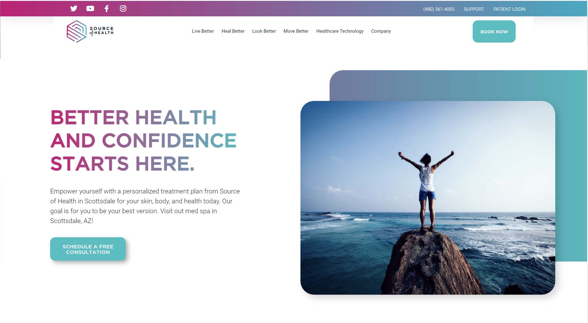
Source Of Health
Source Of Health is an aesthetic and wellness center based out of Scottsdale, AZ. The modern and colorful brand developed with the logo beautifully extends to the site design. The gradient used in the logo is also used in the header, as well as, the header titles. The overall look and feel of the site design is clean and bright with excellent use of white space. The company has done an excellent job of differentiating itself from competitors with a brand and site that really stands out.
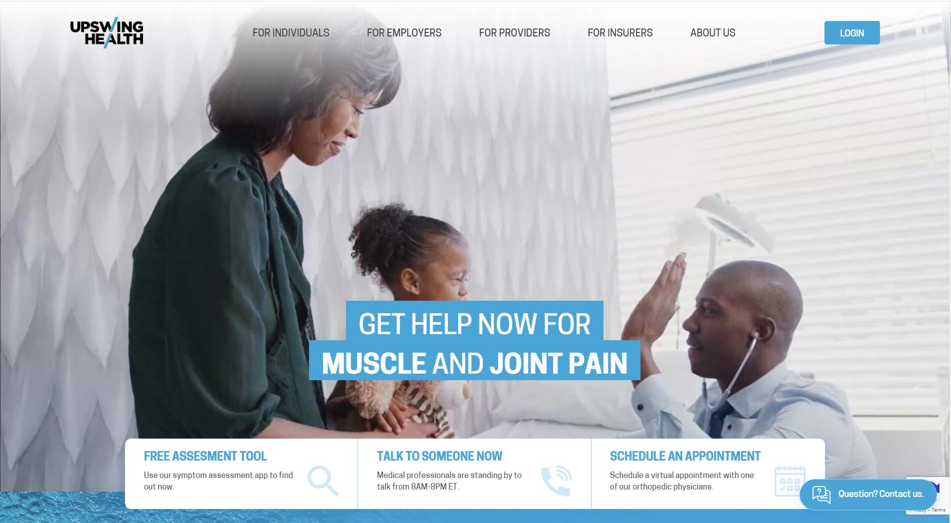
Upswing Health
Upswing Health is a unique online physical therapy medicine resource site. The site utilizes AI to help users understand their conditions and get the care and treatment they need. We love the way elements of the Upswing logo are incorporated into the design. The navigation also guides users down the conversion funnel for each type of potential site visitor. There are dedicated pages for individuals, employees, providers, and insurers.
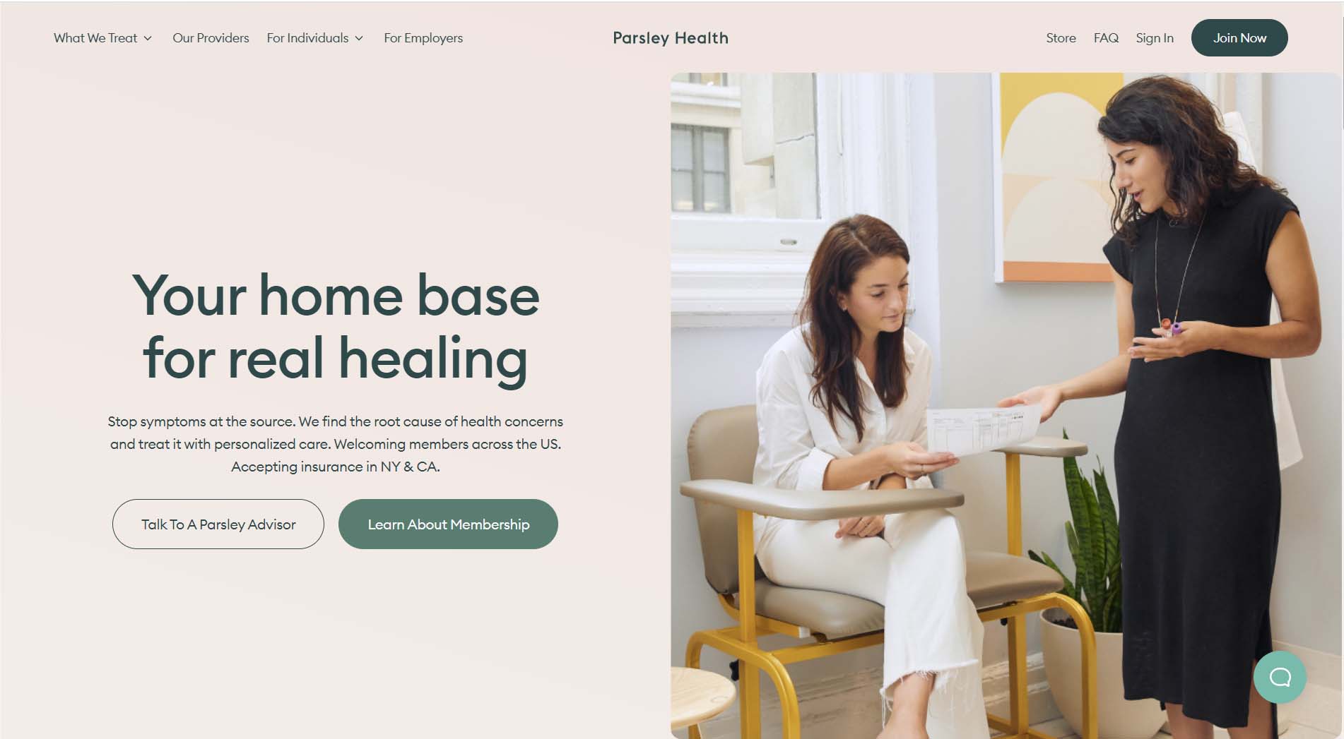
Parsley Health
Parsley Health provides virtual healthcare services with annual memberships that provide access to clinicians and health coaches. The site’s cream, green, and light purple backgrounds provide a welcome divergence from the standard white background. The curved borders for sections and photos also add visual interest and provide a soft and welcoming feel.
Ready to Build or Update Your Healthcare Website?
Inclind Can Help. As a healthcare provider, it is vital that you maintain a website - and that the website is accessible, easy to navigate, and attractive. Our team of experienced website designers and developers can help you achieve this goal.
Based in Delaware, Inclind works with nonprofit organizations, healthcare providers, and other businesses throughout the U.S. Our services include website design and redesign, custom integrations, accessibility audits, automation, conversion optimization, and more. We work collaboratively with each of our clients to make sure that their website doesn’t just meet industry standards - but that it meets their unique needs.
If you’d like to learn more, we’re available to talk. You can fill out our online contact form or hit the live chat button to talk to one of our experts about your website.