
Web Design Best Practices: Design Elements That Drive Results
October 7, 2025
Table of Contents
A great website doesn’t just happen. Instead, it is the result of careful planning, calculated thought, and hard work. This is particularly true when it comes to the layout and design of a website.
A well-designed website requires strategic thinking to figure out how to properly communicate your message, how your intended audience will use your website, and what actions you want the user to take. Design elements like visual hierarchy, attention-grabbing calls to action, and using quality media can all contribute to a great design. Taking the time to plan out your website design for your business, nonprofit, government agency, utility company, or membership organization can result in a website that is both beautiful and effective.
At Inclind, we believe in the power of great website design to truly drive results and help your organization reach its goals. Our creative website services combine branding, content, and interactive elements to create thoughtful, engaging websites that meet your goals. Reach out today to talk to a member of our award-winning website design and development team.
Design Tactics to Optimize Results for Your Website
Building a website involves two core components: website design and website development. Both pieces are equally important when it comes to a smart, functional website.
Website design incorporates both User Experience (UX) and User Interface (UI). UX design focuses on understanding user needs, solving problems, and the user’s overall journey through a website. UI design helps to create the look, feel, and interactivity of a website to ensure that it is visually appealing. Together, UX and UI work together to create the best possible user experience.
There are several design elements that are critical to any website. By incorporating these elements and best practices, you can ensure that your website not only looks good, but it can also increase conversions and engagement and improve trust in your site. Below, we break down some of the design best practices we’ve built after over two decades of designing, building, and optimizing websites.
Consider Visual Hierarchy and Page Layout
If you’ve ever visited a website where you struggled to find the information you were looking for, then you will understand the importance of visual hierarchy. Essentially, this design tactic focuses on organizing the content on your page in a logical way. Ideally, the most important information should stand out, such as the core focus of your organization or information about the products or services that you offer.
With visual hierarchy, you should also think about how you can use contrast, size, and spacing effectively. For example, you will want to use H1, H2, and H3 headers and subheaders throughout your content to break up sections. This will help organize your content and keep it structured in a logical way.
The page design should also be clean. Try to minimize clutter, such as excessive images and buttons. You can also use white space strategically to guide users’ eyes to where you want them to go and funnel them into the next step of the page progression.
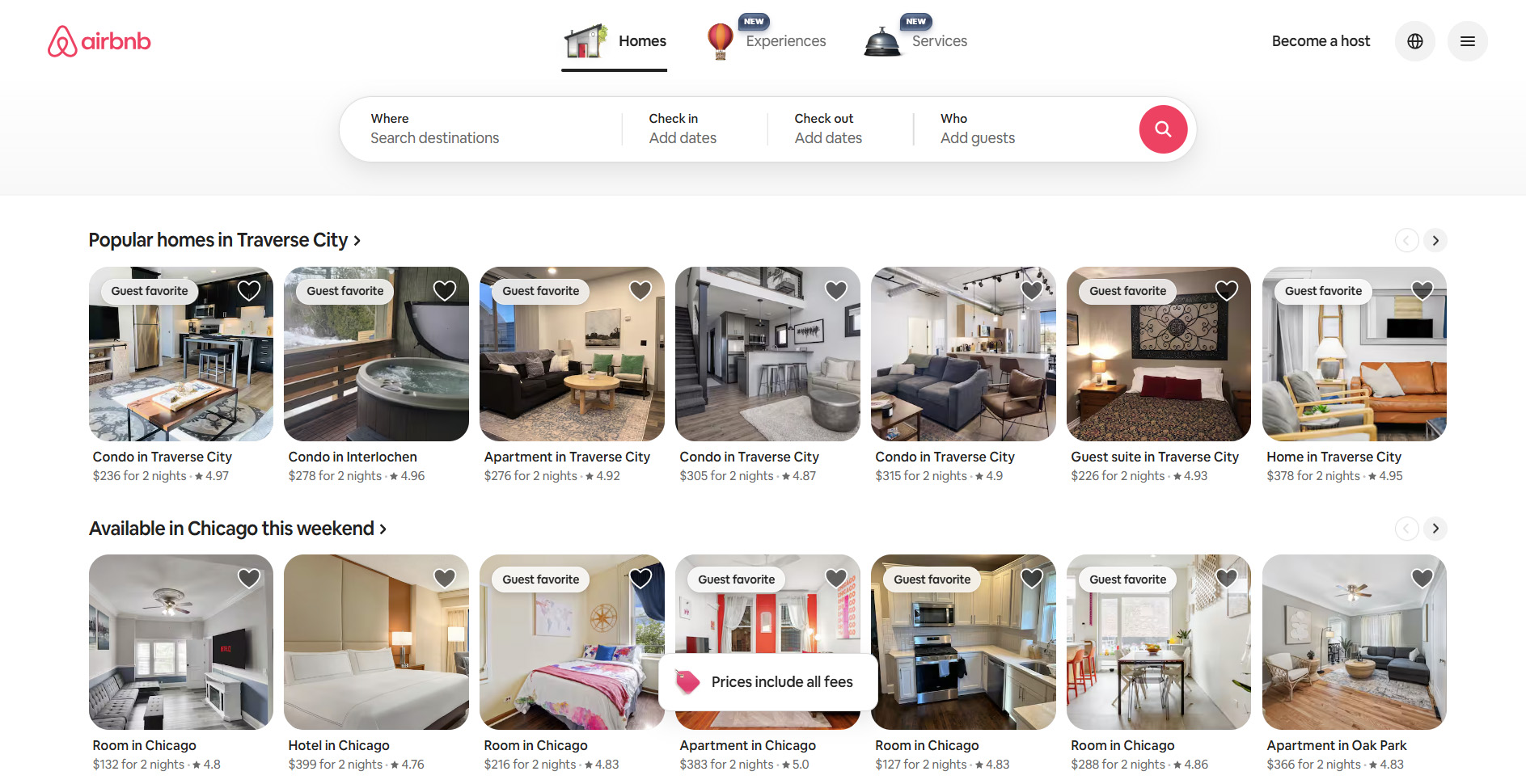
A Website With Good Visual Hierarchy
Airbnb is a great example of proper visual hierarchy. The search bar is featured front and center on the homepage, so that users can quickly jump into finding a rental when and where they might need one. Directly below the search bar are popular listings for nearby destinations to provide users with inspiration for a trip. While Airbnb also offers experiences and professional services, rentals are prioritized in the layout because that is the primary service users are looking for.
Make Navigation Simple
A good website design should be as user-friendly as possible. To that end, consider how people will interact with your website. To start, make all menus intuitive and predictable. Think about how people will get to the necessary information and put items in the appropriate place. For example, if you are making a website for a nonprofit that offers services to clients as well as options for the community to get involved, then all services should be located under one heading (such as “Get Help”) while options for involvement should be under another menu heading (such as “Get Involved”). As a general rule for structuring navigation, the most important pages on your website should be no more than three clicks away from your homepage.
The structure of your website should also be as consistent as possible. Try to put menus, calls to action (CTAs), and other important elements where people will expect them - and keep them in the same place. We recommend fixing your header to the top of the screen on both desktop and mobile. This allows users to fluently navigate from page to page, no matter where they are on a page. Fixed headers prevent users from having to scroll all the way up to the top of the page to view the menu again, which saves time and reduces friction.
As you design, keep in mind that mobile traffic will be greater than desktop traffic for most sites. It’s easy to design with a desktop-first approach because we design on desktops, but taking a mobile-first approach to design can yield better results.
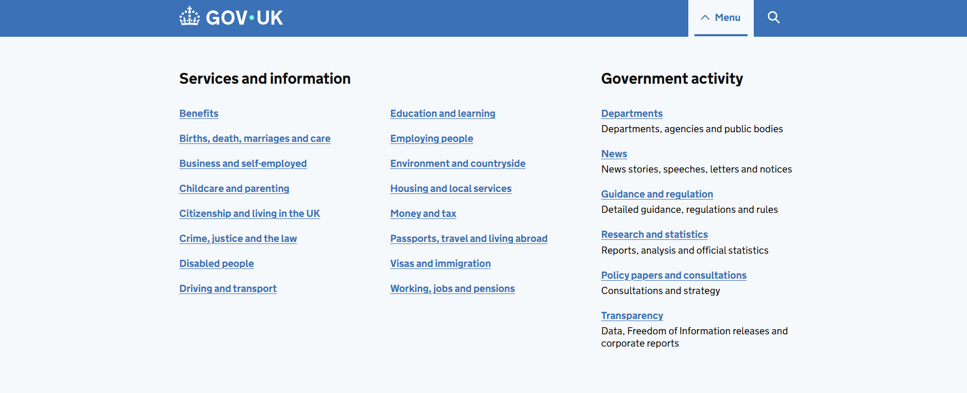
A Website With Simple Navigation
Government sites don’t typically have a reputation for being user-friendly. However, the UK government site is a textbook case of simple, predictable navigation. Despite spanning 24 departments and providing a wealth of different public services, the UK government has been able to condense its main menu into just 22 links that still allow users to clearly navigate to the information they’re looking for.
Choose a Readable, High-Contrast Font
It can be tempting to choose a “fun” font for your website. You may even find a font that looks really good with your branding. Yet when it comes to website design, the main concern should always be readability.
You can get a bit creative with your font, because it is part of the overall visual appeal. Yet at the same time, it has to be legible. This is important when it comes to the usability of the website. It is also key for accessibility, as certain fonts may make it harder for people with disabilities to read them.
The font should also sharply contrast with the background (such as black text on a white background). If there isn’t enough of a contrast between the font color and the background, it will be incredibly difficult to read (for all visitors to your website).
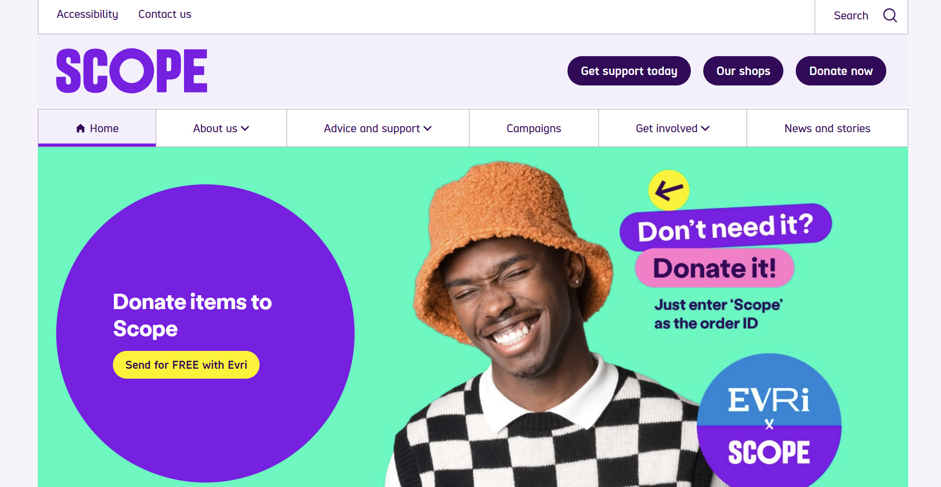
A Website With Readable Text
Scope is a nonprofit that aims to provide employment opportunities for those with disabilities. Naturally, it makes sense that an organization serving a wide base of constituents with varying visual abilities would excel at making its content readable. Scope still uses a variety of fonts and colors to create visual interest, but all text elements are legible and contrast with their backgrounds well.
Use Color Wisely
One important element of any design is color. You should use colors that are part of your branding kit throughout the website design. Keep in mind that these colors should be used in a way that does not make it harder to read or navigate the website. For example, a brand color can be used for buttons, but might not be appropriate for text due to readability.
Beyond brand colors, you can use colors to influence emotions and actions. For example, you can use a high contrast color that grabs attention (like red) for CTA buttons. If you want to evoke thoughts of a particular emotion, such as excitement or serenity, you could pick colors that work well with that theme.
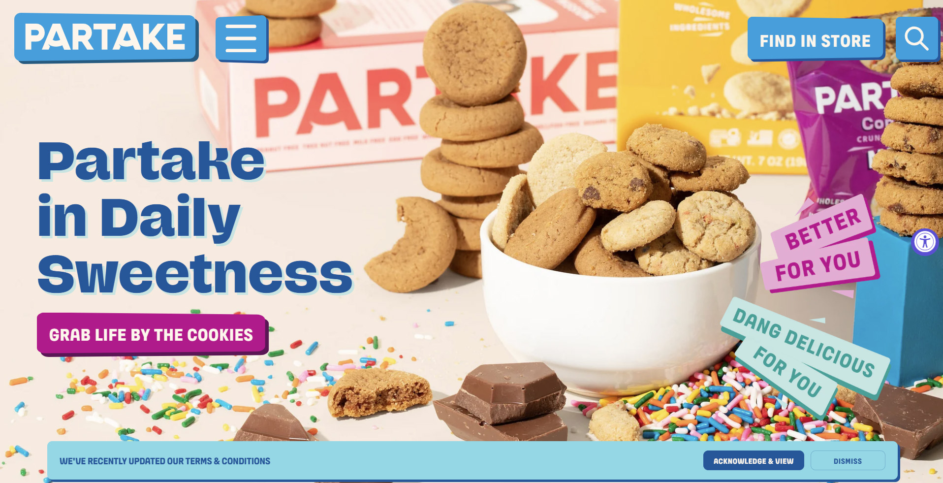
A Website That Uses Color Wisely
Partake uses its colorful brand palette throughout the site design, but doesn’t overuse it in ways that hamper usability. Accent colors are reserved for buttons, links, CTAs, or important highlights, but they’re not used for large text bodies or background/text combinations that reduce legibility. Partake also often uses neutral backgrounds (white, off-white) so the brand color becomes a visual accent.
Make Your CTAs Pop
Calls to action (CTAs) are an incredibly important part of any website. They are ultimately about what you want people to do when they visit your website: order a product, book a service, make a donation, or join your membership organization. For this reason, you should be very thoughtful about your CTAs.
To start, think about where your CTAs are placed. You should always have one “above the fold,” which means that it should be visible on page load when a person navigates to a page. CTAs should be located throughout the page in a consistent, logical way.
You should also consider the design of your CTAs. Color, size, and shape can be used to draw attention to the CTAs, which can help to increase conversions. The text on your calls to action ideally should indicate the end goal of the action. As an example, form submit buttons are commonly labeled “Submit”. However, if it were a form to request a consultation, you could change the label to “Request Your Free Consultation” to reiterate to the user that the end goal of submitting the form is getting a consultation scheduled.
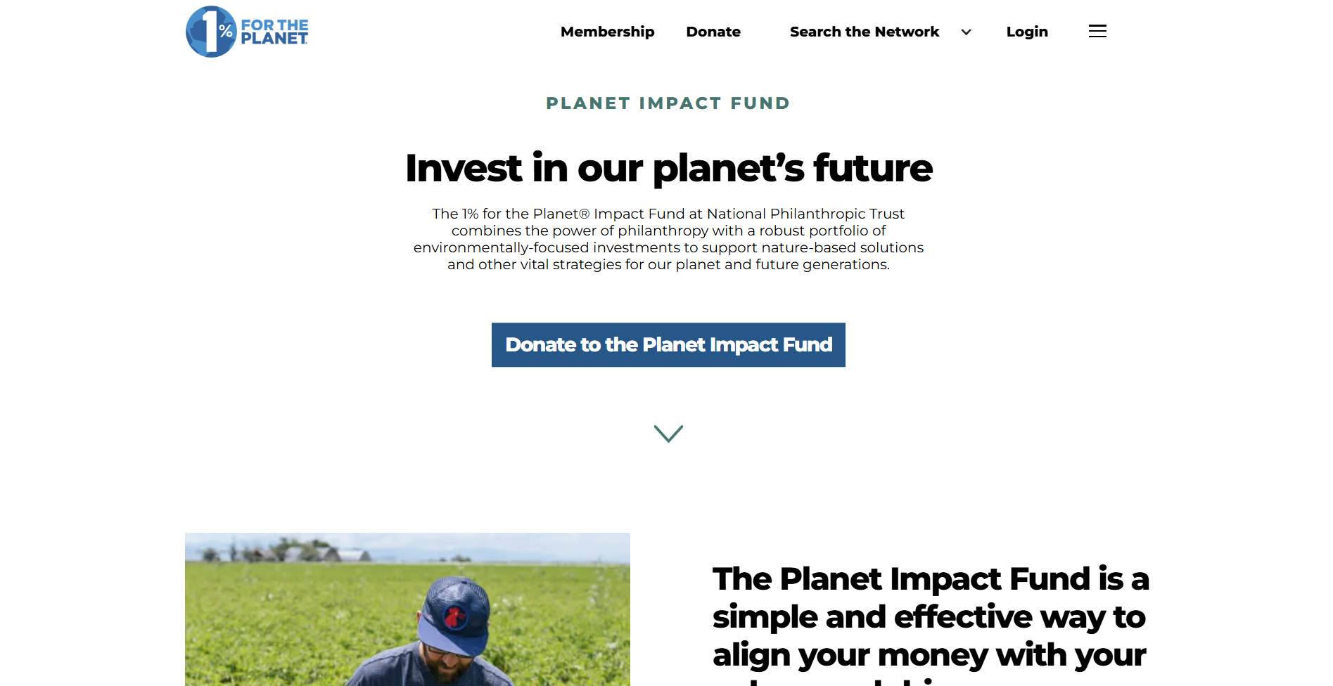
A Website That Optimizes CTAs Well
1% for the Planet uses color, contrast, and size to give its CTA buttons strong visual weight. As a nonprofit organization, 1% for the Planet operates on donations, which makes growing membership and collecting donations the target actions for the organization. As such, join and donate buttons are placed above the fold on many of the site’s pages.
Choose High Quality Images and Videos
When using photographs, videos, and other forms of media, be sure to focus on quality over quantity. While it may be tempting to pack your page layout with media, doing so can make it look cluttered - and slow your website down. Instead, use professional photographs and videos more sparingly. Keep the focus on relevant content so that you don’t confuse or overwhelm visitors.
For videos, try to keep them relatively short. Most users won’t necessarily watch a 15-minute video, but they will probably click on a video that is 1 - 3 minutes in length. Keep the content focused on what matters, editing for length and clarity so that people are more likely to engage with it. If you do post videos on your website, make sure that the files are compressed. This will help to ensure that your website isn’t slowed down while maintaining quality.
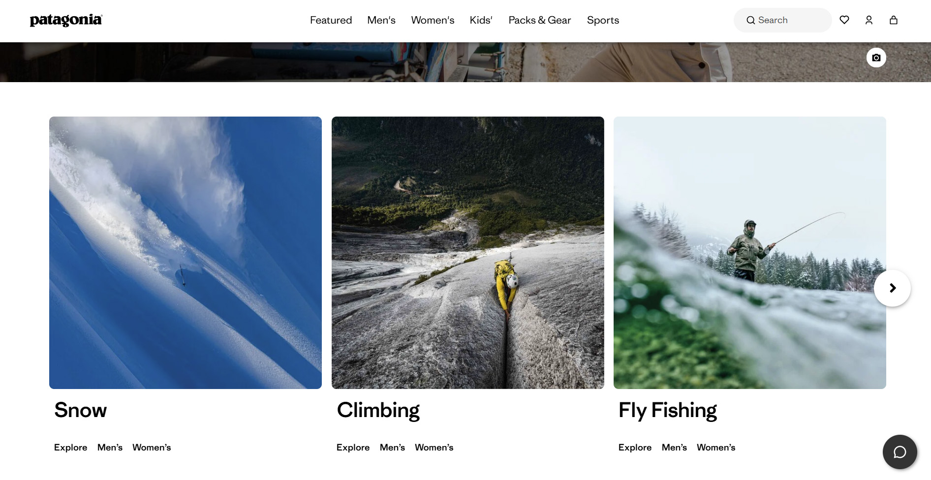
A Website That Uses Media Correctly
As one of the largest outdoor fashion brands, Patagonia excels at using imagery to sell its products. Imagery on the site showcases Patagonia products being used in the environments they're designed for to allow users to imagine wearing the pieces while partaking in their favorite hobbies. The visuals reinforce the brand message and mood without distracting or overwhelming the content.
Use Motion Sparingly
Animated media should also be used thoughtfully. A common mistake many designers make is to add a slider to page heroes by default, because they “look cool”. While motion is captivating, sliders and carousels can muddy the user experience.
Sliders work for brands like Amazon and Walmart, where users have differing intents and the brand offers a wide variety of products and promotions that they’d like to showcase. The issue with sliders is that many users won’t see more than the first slide before scrolling or clicking through to another page. So, an important message may be lost if it’s buried in a slider. For most brands, utilizing a static hero with just one clear message and call-to-action yields better results. As an example, if you’re designing a credit union website, instead of creating a slider to highlight your banking, loan, and investment services, it’d be better to focus on your banking services and then have a quick navigation section below the hero to highlight your other services.
Discretion should also be used when animating other elements. Some designers will animate every header or every image. The more animations you add to a page, the slower it will load, which may hurt your conversion rates. If you’re going to add animations to pages, focus on animating elements that you really want to call a user's attention to.
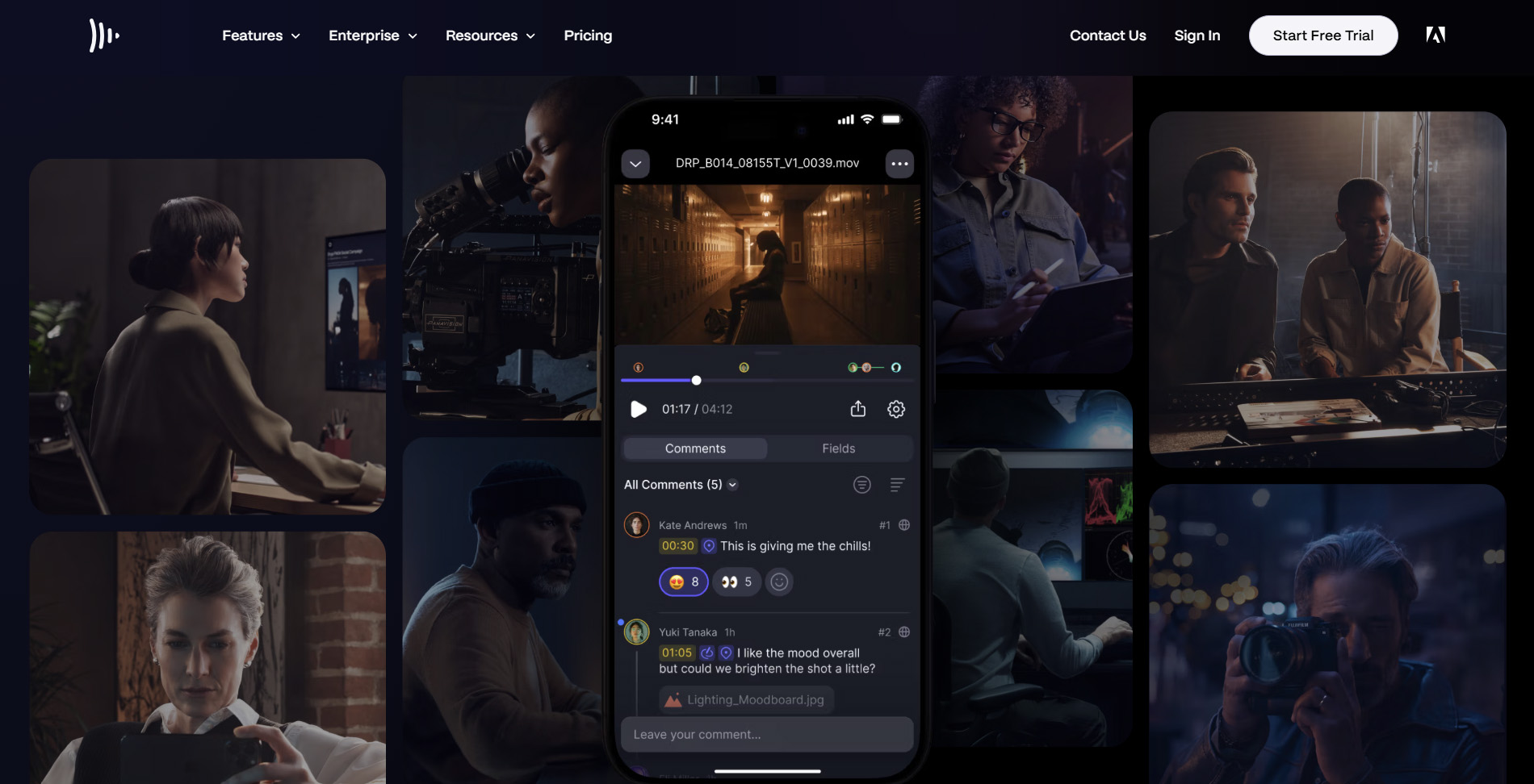
A Website That Uses Motion Thoughtfully
As a tool primarily designed for video production, you’d expect some movement and animation on the Frame.io website. Frame’s homepage includes a slider to showcase various sharing and presentation features. The app’s user interface is also highlighted with parallax scrolling used to showcase various screens within the app. The animation used on the Frame site works because it accents important parts of what the brand is trying to communicate instead of creating unnecessary visual distraction.
Include Trust-Building Design Elements
In a time when spam calls, texts, and emails seem omnipresent, making sure that your website is portrayed as trustworthy is incredibly important. There are certain design elements that you can use to help people know that your website is safe.
To start, make sure that you employ any visible signs that your website is as secure as possible. This may include trust badges (SSL badge, PCI compliance badges, McAfee or Norton seals, etc.), cookie consent pop-ups, and return and privacy policy links. You can also work any awards or certifications into your design to further build trust as a reputable company.
Testimonials are another great way to build credibility. If your customers have left reviews, including them on your website can be a great way to show that your organization has a history of providing great service.
Overall design is also important in establishing trust. When you have a consistent design, your website will look more professional. That can give users confidence in knowing that your website is legit.
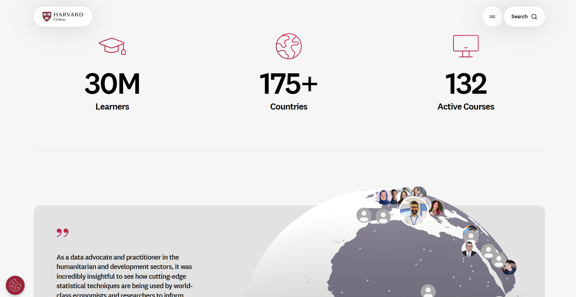
A Website That Excels At Trust-Building
As one of the world’s most prestigious universities, Harvard doesn’t have to work very hard to build trust with users, but the university still does a great job of clearly presenting trust signals on its online course site. The homepage includes statistics on how many courses the school offers and how many students the university has served to visually demonstrate an established presence. Users can read testimonials from students all over the world in an interactive testimonial section. Credentials are available for all University professors, and a fixed cookie icon at the bottom of the screen allows you to adjust your cookie settings.
Make Sure Your Website Is Accessible
One of the biggest design elements - that many people overlook - is accessibility. This concept involves making your website usable for anyone, regardless of their abilities. Accessibility design principles, such as high-contrast fonts and the ability to navigate using the keyboard, make your website more usable for everyone. Common ways to improve site accessibility include:
- Add alt text for all meaningful images
- Provide captions and transcripts for audio and video content
- Use labels for all form fields
- Ensure buttons and inputs have meaningful names
- Maintain good color contrast for text
- Use resizable text without breaking layouts (support up to 200% zoom)
- Choose readable fonts and avoid overly stylized or small text
- Make your link text descriptive (“Read about our services” instead of “Click here”)
Website accessibility is legally required under the Americans with Disabilities Act. It is also a good idea to incorporate accessibility as part of your website design to drive results. Our team of skilled website designers can help you determine your accessibility needs and then include these principles as part of your web design.
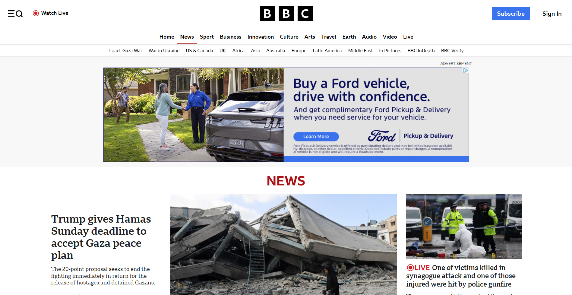
A Website Built Around Accessibility
The BBC website is an excellent example of an accessible site. Images are marked up with very descriptive alt text, the site can zoom to 200% without breaking, and it can even be entirely navigated using the tab and arrow keys (no need for a mouse).
Ready for a Website Design or Redesign? We Can Help!
A great website isn’t just about the coding and technical details (although the site code and architecture are still important). A great website starts with a stellar design that clearly communicates your message in a way that is beautiful, functional, and leads users down your conversion funnel. If you are ready to build a new website - or redesign an existing site - we are available to chat.
Based in Delaware, Inclind’s team of award-winning website designers and developers works with clients throughout the country to help them build websites that are both beautiful and effective. It all starts with the design, where we take the time to learn about your organization, your goals, and your anticipated audience for the website. We will utilize our expertise in UI and UX, combined with your knowledge of your own business, to create an outstanding website design.
If you'd like to learn more about our website design and development services, we are always here to talk with you. You can fill out our online contact form or hit the live chat button to speak to one of our experts about your website design or redesign.
MORE NEWS
